0 members and 519 guests
No Members online

» Site Navigation

» Stats
Members: 35,442
Threads: 103,075
Posts: 826,688
Top Poster: cc.RadillacVIII (7,429)
|
-
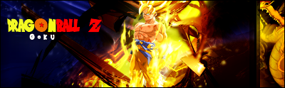
 DragonBall Z goku sig DragonBall Z goku sig
-
I think it was smart of you to choose the text that goes with the show, however i do not think it actually works in this sig haha. You have a very action pact sig and high tech looking efffects and then you bring in this scribbly looking block font. doesn't really work when you think about it.
Drop the etxt and that block thing on the side and it's be a lot better.
the red and blue are working really weell in this you did good with it. nice job.
 My DevART
RATCHET is my bitch
Andrew says:
u ever stolen a bible?
Apathy says:
no
used the last two pages to roll a joint though
Andrew says:
wow
thats fucking hard core
^^HAHAHA, dm sucks XD
-
lol i thought the same thing m8 will post the newier resultz latter ... ty for cnc bud ,,, i like draggon block thoe ahha it took up that empty space i couldnt think to put there so yeah heheh ty again m8
-
ok with out txt and side bar

-
-
yeah a high tech font would flow.
try clipping masking it?
-
where can i get a high tech art text?
Similar Threads
-
By asdio in forum Sigs & Manips
Replies: 3
Last Post: 05-01-2008, 09:18 PM
-
By imported_worldikon in forum Digital Art
Replies: 4
Last Post: 04-14-2006, 02:49 PM
-
By Auto in forum Digital Art
Replies: 5
Last Post: 08-29-2005, 12:31 AM
-
By ICBrother in forum Sigs & Manips
Replies: 3
Last Post: 08-08-2005, 10:34 PM
-
By GreeneBeast in forum Sigs & Manips
Replies: 3
Last Post: 02-27-2005, 05:01 AM
 Posting Permissions
- You may not post new threads
- You may not post replies
- You may not post attachments
- You may not edit your posts
-
Forum Rules
|


 Reply With Quote


