0 members and 390 guests
No Members online

» Site Navigation

» Stats
Members: 35,442
Threads: 103,075
Posts: 826,688
Top Poster: cc.RadillacVIII (7,429)
|
-
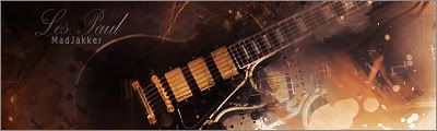
 Spark Up Spark Up

just tryin some new stuff out.
-
And here I though I was about weed, got my hopes up.
Umm.. lightsources look overbrightened and kindy make the whole sig look hazy. CD4's are nice though
-
Good C4d placement but no depth, and the text as a clipping mask, I'm not crazy about. It's got some good technical work but it doesn't look spectacular. 
 Originally Posted by MarkPancake

MarkPancake banned.
Success.
-
thnx guys it was more of an experiment rlly.
just trying it out.
thnx for the tips.
-
is that a clipping mask on the text??
anyways ITS LUSH!!
-
Nice ,it really gives the SPARK up effect..Looks good to me!

Go GFX viod!
-
thanks suddu and madjakker
-
Yeha i don't knwo on this one man. The text isn't really working. It's got nice color but it's too bright. The clipping masks aren;t really helping yur lack fo flow either. This isn't as good as your others I'm not a fan.
 My DevART
RATCHET is my bitch
Andrew says:
u ever stolen a bible?
Apathy says:
no
used the last two pages to roll a joint though
Andrew says:
wow
thats fucking hard core
^^HAHAHA, dm sucks XD
 Posting Permissions
- You may not post new threads
- You may not post replies
- You may not post attachments
- You may not edit your posts
-
Forum Rules
|


 Reply With Quote