GFXVoid Graphic Design Forum

Remove Text Formatting
Loading...

» Online Users: 11,465

0 members and 11,465 guests
No Members online

» Site Navigation

 > FAQ

» Stats

Members: 35,442
Threads: 103,075
Posts: 826,688
Top Poster: cc.RadillacVIII (7,429)
Welcome to our newest member, Lekelindids
Results 1 to 7 of 7
  1. #1
    Join Date
    Sep 2008
    Posts
    1,589

    Default Winters Delight ~ manip

    Background Stock Used:

    http://wallpapers.net/old_bench_in_the_park-wallpapers

    Woman Stock Used:

    http://rammkitty-stock.deviantart.co...ent3-104060603

    Hair Brush Used:

    http://trisste-brushes.deviantart.co...-Hair-98012317

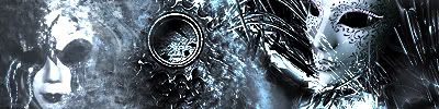
    Another manip here. Once I had rendered the woman I then set about making her blend into the background.

    I think I achieved this fairly well. Tried out a lot of new things with this manip.

    Vers1


    Vers2:

    Devaintart Page:

    http://bonesma.deviantart.com/art/Wi...ight-104757972

    I hope you like it much thanks for your time and comments.

    p.s.

    Thats the smallest of topaz put on here its the cutout filter that gives it the topaz look
    Last edited by BonesMa; 11-27-2008 at 09:57 AM.

  2. #2
    Join Date
    Jan 2007
    Location
    Minnesota
    Posts
    5,091

    Default

    NOt bad. Nice blending and lighting flows throughout the sig.
    I can only think of one way it'd be better and that is if it was less orange it'dbe way better. right now it's like pumpkin and you need to make it less orange.


    My DevART
    RATCHET is my bitch
    Andrew says:
    u ever stolen a bible?
    Apathy says:
    no
    used the last two pages to roll a joint though
    Andrew says:
    wow
    thats fucking hard core
    ^^HAHAHA, dm sucks XD


  3. #3

    Default

    it looks very good, everything is put together really well. its very orange though o.O
    great job!

  4. #4
    Join Date
    Sep 2008
    Posts
    1,589

  5. #5
    Join Date
    Nov 2008
    Location
    USA - New Hampshire
    Posts
    627

    Default

    why is it 'winters' delight if it looks like fall

  6. #6
    Join Date
    Jul 2008
    Location
    Vancity, Canada
    Posts
    2,985

    Default

    I really like it, but for me it's a bit orange. LOVE the blending and it looks great, just a bit saturated.
    Quote Originally Posted by MarkPancake View Post
    MarkPancake banned.
    Success.

  7. #7
    Join Date
    Jul 2008
    Location
    Sweden, Småland, Mönsterås
    Posts
    57

    Default

    Fantastic, brilliant, awesome, FRIKKIN NICE ONE! =D
    I'm new to this sig-making-stuff...

Similar Threads

  1. Pink Delight
    By Chaotic Cow in forum Digital Art
    Replies: 9
    Last Post: 07-11-2007, 12:32 PM
  2. Bluevilicious Fractal - Pinkstervian Delight
    By wfcamb in forum Digital Art
    Replies: 3
    Last Post: 06-29-2007, 02:07 PM
  3. Winters Bite
    By shajn in forum Digital Art
    Replies: 11
    Last Post: 04-29-2007, 07:59 AM
  4. Winters Warmth
    By BLiZZ in forum Digital Art
    Replies: 20
    Last Post: 12-12-2005, 05:35 PM
  5. Pure delight
    By Sumomo in forum Sigs & Manips
    Replies: 2
    Last Post: 09-29-2005, 03:29 AM

Posting Permissions

  • You may not post new threads
  • You may not post replies
  • You may not post attachments
  • You may not edit your posts
  •  
Powered by vBadvanced CMPS v4.1.1