0 members and 2,004 guests
No Members online

» Site Navigation

» Stats
Members: 35,442
Threads: 103,075
Posts: 826,688
Top Poster: cc.RadillacVIII (7,429)
|
-
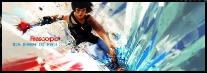
 its easy to fall!! its easy to fall!!
a mirrors edge sig, probably xD not like anything i had done before im trying to stay away from what i used to do, because it was getting very repetitive xD (was watching my older sigs) i know my quality might be lacking a this point >.<
just got back to signage =P after a loong while i hope u guys like the sig im pretty happy with the result myself xD
CnC as always Pl0x
(the bitch is back XDD)
newest:

Fav :

The true and only Firescorpio!
(no autographs please)
-
Great work man, i love the colors SOOO much. The c4d near her hand does seem to be a bit oversharpened though (the hand at the bottom of the sig)
the text is nice, good colors and placement and everything. it all seems a little flat to me though, try adding in some depth, i see some depth but it still seems very flat... if you know what i mean.
Great job man, doesn't seem like you've taken a break at all, doing nice sigs in a new style :P

Et Tu?
SilentShadow | Jorrne | Arcmenis | Garis | Splinter | Sanbu | DeadlesS | Tekken | Proflax | Suddu
-
-
-
The best mirrors edge sig i've ever seen. 
Great work el feugo
-
Very nice tag only problem is that the bottom C4D near her left hand is to sharp and her face is all blurred.. but otherwise GJ (Y)
-
I'd like to see it sharpened a bit more. The c4d's are great and the colors are fantastic but it's a bit hard to make it all out so sharpen it a bit more so you can really get a fast motion feeling.
The text on this one is also brutal. Your firescropio text is fine but the rest needs work. STick to defaults. I know you make your own fonts and all thats jazz but right now it seems like you lack the understanding of how to blend the font into your sig. it's probabaly just that rust though.
Maybe just add a lightsource, or a few couple sparkly things somwher ein the bg to make ti really have flair.
 My DevART
RATCHET is my bitch
Andrew says:
u ever stolen a bible?
Apathy says:
no
used the last two pages to roll a joint though
Andrew says:
wow
thats fucking hard core
^^HAHAHA, dm sucks XD
-
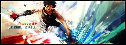
thnks for the CnC guys yeah ill be working on the details for a V2 =P
newest:
Fav :
The true and only Firescorpio!
(no autographs please)
-
here goes V2 not sure still but tell me what u guys think XD
newest:
Fav :
The true and only Firescorpio!
(no autographs please)
-
Muuch better, its a lot sharper and I see depth in the right places and the sig just looks awesome.
Great job mens.
Et Tu?
SilentShadow | Jorrne | Arcmenis | Garis | Splinter | Sanbu | DeadlesS | Tekken | Proflax | Suddu
-
-
The new version is the best, you fixed most of the depth problems and it looks pretty nice, now that it's correctly sharpened.
Got here a bit too late to say most of the things I wanted to say, so looks great, and glad to have you back with us!!! 
 Originally Posted by MarkPancake

MarkPancake banned.
Success.
Similar Threads
-
By lasergoPEW in forum Digital Art
Replies: 6
Last Post: 12-12-2008, 06:03 PM
-
By nazz in forum Digital Art
Replies: 6
Last Post: 08-19-2007, 12:00 PM
-
By Lord_badass in forum Sigs & Manips
Replies: 3
Last Post: 05-25-2006, 07:35 AM
-
By dragoneye in forum Digital Art
Replies: 15
Last Post: 02-19-2006, 08:04 PM
-
By katgirl21 in forum Digital Art
Replies: 8
Last Post: 10-12-2005, 10:57 PM
 Posting Permissions
- You may not post new threads
- You may not post replies
- You may not post attachments
- You may not edit your posts
-
Forum Rules
|


 Reply With Quote


