0 members and 7,276 guests
No Members online

» Site Navigation

» Stats
Members: 35,442
Threads: 103,075
Posts: 826,688
Top Poster: cc.RadillacVIII (7,429)
|
-
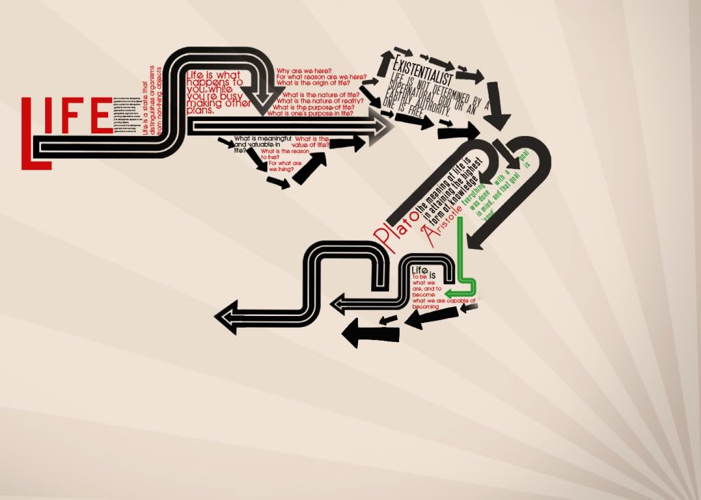
 Life LP Life LP
this is a Life typography LP i have been working on the concept is life and roadss . . . it still on early conception, but i got scutk halfway through it idk anymore, any suggestions CnC are highly appreciated.... xD creative block FTL
(scaled down version sory for the low quality of it)
newest:

Fav :

The true and only Firescorpio!
(no autographs please)
-
I kind of dislike this one tbh. It's okay but not the best. The Star shines or whatever those lines in the BG are called are kinda old and i know they look cool but they are whored in like every vector LP possible.
The arrows bother me thatway too. I feel like arrows have become like a filler to make anything fit together with minimal work.
now now, before you start thinking he doesn't understand the concept. I do. The arrows are meaning for like new stages in your life and for every new stage theres a quote. ANd it just keeps going forward. However i think you should use less arrows for it, right now theres just a few too many of them, but then again i also just dont like using arrows in general so im biased.
I can't read like half the text and i don't know whether thats intentional or not. I would think you'd want me to read the important stuff like quotes from aristotle.
OVerall this is definetly a WIP and you definetly need to refine this a bit, but i really enjoy the concept of it. cool idea.
 My DevART
RATCHET is my bitch
Andrew says:
u ever stolen a bible?
Apathy says:
no
used the last two pages to roll a joint though
Andrew says:
wow
thats fucking hard core
^^HAHAHA, dm sucks XD
-
Never knew Plato and Aristotle done those quotes. I've done loads of work on them and their accounts of Sparta 
I agree with Papa pretty much 100%.
However i could live with the arrows if you experimented with some pattern inside of the shapes. IE Make them up of lines etc. For me however, they have no meaning or actual direction ( although this may be relevant to life...  ) )
I would just work on composition, and also you have to think, how many people are actually going to read half that text? maybe 5%?
If you know of Plato and Aristotle, then i'm sure you will know about the Spartans and their minimalistic way of speaking, which tended to have more impact then a huge load of text. Think about this in your next typography piece maybe
Papa sums it up " OVerall this is definetly a WIP and you definetly need to refine this a bit, but i really enjoy the concept of it. cool idea."
-
-
Agree with above, completely need a texture, I really like the idea, and Typo's are always nice if done well. 
Good luck!!!
 Originally Posted by MarkPancake

MarkPancake banned.
Success.
-
thnks for the CnC guys yeah imm gonna work on it as soon as i get it together prolly gonna work it out first on paper draw it and then move into changing i think it has some good potential but at the moment its lacking alot ill be posting an update soon i hope
newest:
Fav :
The true and only Firescorpio!
(no autographs please)
-
It's okay i guess. The quotes as they may be called are okay. Search some up on google. The background is a little...hmmm...just read the other posts.
Similar Threads
-
By Light in forum Digital Art
Replies: 8
Last Post: 12-08-2007, 07:43 AM
-
By Ragidy_man in forum The Void
Replies: 21
Last Post: 12-20-2005, 01:19 PM
-
By PlatinumKittyKat in forum Digital Art
Replies: 3
Last Post: 08-27-2005, 06:57 PM
-
By Runch in forum Digital Art
Replies: 1
Last Post: 07-25-2005, 11:18 PM
-
By |Vice| in forum Sigs & Manips
Replies: 6
Last Post: 07-17-2005, 10:48 AM
 Posting Permissions
- You may not post new threads
- You may not post replies
- You may not post attachments
- You may not edit your posts
-
Forum Rules
|


 Reply With Quote


