0 members and 581 guests
No Members online

» Site Navigation

» Stats
Members: 35,442
Threads: 103,075
Posts: 826,688
Top Poster: cc.RadillacVIII (7,429)
|
-
-

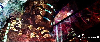
tight sig. The colours and blending are nice killzone text is ok too.
That junaid text is just plaing horrid though, and you put it in every sig? what is it a water mark?
-
YESH!!! junaids back!!! WB junaid!
everything is bomb except that junaid text i know its kinda your signature but it rly rly kills most of your sigs i highly suggest you kil that trend quickly.
Also i think you should add a bit of contrast. Right now there seems to be a few things that are flickering over the render and it'd work much better if you just add a nice levels to it.
 My DevART
RATCHET is my bitch
Andrew says:
u ever stolen a bible?
Apathy says:
no
used the last two pages to roll a joint though
Andrew says:
wow
thats fucking hard core
^^HAHAHA, dm sucks XD
-
Agree with the above, the strength in colour seems weak and the text brings it down, but i think the efx and lighting are nice
-
To be honest, I think the text and watermark looks awesome in this signature. The others I'm not too fond of, but I think it really works here.
I would like to see a bit of sharpening, because the colors all look a bit slack, and it is making the render/focal blend in TOO much.
Fav^
-
Similar Threads
-
By Studhorse in forum Digital Art
Replies: 2
Last Post: 12-23-2008, 03:26 PM
-
By Sobek in forum Digital Art
Replies: 4
Last Post: 08-10-2005, 07:14 AM
-
By Scoopable in forum Sigs & Manips
Replies: 1
Last Post: 07-27-2005, 04:57 PM
-
By Fallen Angel in forum Sigs & Manips
Replies: 2
Last Post: 07-24-2005, 07:05 PM
-
By K a 0 s in forum Sigs & Manips
Replies: 6
Last Post: 07-22-2005, 08:03 PM
 Posting Permissions
- You may not post new threads
- You may not post replies
- You may not post attachments
- You may not edit your posts
-
Forum Rules
|


 Reply With Quote


