0 members and 695 guests
No Members online

» Site Navigation

» Stats
Members: 35,442
Threads: 103,075
Posts: 826,688
Top Poster: cc.RadillacVIII (7,429)
|
-
 Two New (Question) Two New (Question)
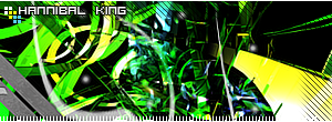
Here's the first one ::

Followed ratchets iron man tutorial, as always feedbacks welcome!
Also, quesiton. Is this abstract or anything close too it? If not can someone give a good link to one or a tutorial or some tips on what to aim for when making abstract work.

-
That looks incredible! Maybe I'm not the best one to judge, not the most experienced, but that looks great! It's a sweet render, and I love the text. Good color blending, vibrant but not too bright. Good job dude!
Latest:

-
Thanks Kcfc, bump :: Can someone answer my question please!
-
I dunno for some reason it doesn't look "abstract" to me, but I dunno, it quite aswell could be.
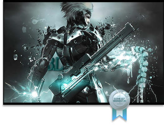
For the first sig, I'd have to say the backlighting is abit bright, since the rest of the sig is to darker looking. It just looks like one big white blob in the center. You have quite the nack for good depth, really like it. Another thing is try to blend the render in abit more, especially within the white blob =P. Good job none the less, I'd give it a 7/10
Last edited by Paraphrased; 12-30-2008 at 02:51 PM.
-
-
Sweet, HK 
-
-
Daaamn man, nice depth. I think that's amazing I love the effects, the left side is a liiittle shaky imo but it all fits together nicely. Text is killing it for me, its a little big and too centered, it detracts from the sig. As someone else... idk who... said above me, the colors don't really work with the night elf render.. maybe some green and blue? Good job

Et Tu?
SilentShadow | Jorrne | Arcmenis | Garis | Splinter | Sanbu | DeadlesS | Tekken | Proflax | Suddu
-
Similar Threads
-
By kompakt in forum The Void
Replies: 21
Last Post: 11-11-2005, 04:05 PM
-
By Noodlez in forum The Void
Replies: 4
Last Post: 06-11-2005, 03:03 AM
 Posting Permissions
- You may not post new threads
- You may not post replies
- You may not post attachments
- You may not edit your posts
-
Forum Rules
|


 Reply With Quote