0 members and 695 guests
No Members online

» Site Navigation

» Stats
Members: 35,442
Threads: 103,075
Posts: 826,688
Top Poster: cc.RadillacVIII (7,429)
|
-
-

no depth at all for either mate, I would try and fix that before anything else
I actually like tags like the first with textures and such, but idk it just looks odd here, mayb don't add it to the final version and maybe to just a layer earlier on (also detracts from the depth)..
they're not bad, just need a few tweaks here and there
-
agreed with gallagher no depth at all in both sigs, what do we mean by depth a feeling of realism of foreground background, which gives out an effect that there is a scenery and motion going on instead of having the render slapped on a fabric or stock background.
the flow on the sigs is very boring as for the backgrounds there isnt not much going but at the same time with so much empty space its easy to wander around, since there isnt much emphasis on the focal point itself. (the render)
there is a atempt at lightning but i dont think its quite working, the light is indeed coming from the right direction but seems a bit wrong or maybe its just the whole feeling to the sig.
as for the text i know what papa would tell you or anyone else, kudos on using degault font text. but i say NO NO NO NO =p to that
text is about feeling and experimentation, using default text makes the sig inpersonal and very default. adding text even! if in a sense ti doesn't look so good at the same time might become part of your trademark so try playing around with the fonts, normally using one that matches the theme of the sig can eb accurate.
(ofc taking notice on composition and all)
i think sorry if im wrong you are quite a beginner and are ok attempts for starting out and as daemons degault welcome post would say on the introductions secion xD i tell you
"take a dive into our large selection of tutorials and welcome to the void" =P
newest:

Fav :

The true and only Firescorpio!
(no autographs please)
-
 Originally Posted by Gallagher

no depth at all for either mate, I would try and fix that before anything else
I actually like tags like the first with textures and such, but idk it just looks odd here, mayb don't add it to the final version and maybe to just a layer earlier on (also detracts from the depth)..
they're not bad, just need a few tweaks here and there
compleltly agree, btw gallagher your current is fricken bomb.
I wouldnt always do what kidbuu said. though it's good advice it doesnt work on all sigs. Usually the best way is to overlap a clipping mask or c4d or something. it's simple easy and works well.
a thing to know kirixia is try not to use photoshop's default patterns/ textures. they are horrible and give a very repetitive feeling.
overall they arent horrible but need mroe depth, follow what gallagher and them said.
 My DevART
RATCHET is my bitch
Andrew says:
u ever stolen a bible?
Apathy says:
no
used the last two pages to roll a joint though
Andrew says:
wow
thats fucking hard core
^^HAHAHA, dm sucks XD
-
Hmm I have never had any tutorial which included something about depth so I guess I'll search through that tut part to get one (it'll be a drag to find one tho)
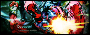
And I intended the first to be quite simple because imo that fits spike better than too much crap around him. Thought the texture at the end would be a nice alternative for C4Ds and brushes in the background.
As for the texts, I reckon I pretty much took a default text for spike but the one I used for iron man just felt more ironman-ish to me. Kinda metal-like and I thought that by adding the crown to it it would give it just that little bit extra.
I'll give both of them another try though and maybe just start over from scratch since they both looked 'odd' in your eyes. I guess there's always room for improvement.
Thanks a lot for the comments guys and it'd be greatly appreciated if you could help me find (a) tutorial(s) which cover(s) my weaknesses 
Started making sigs November 16th 2008
-
do this:
On the first sig, smudge the render and duplicate once, tehn put the first rendr on soft light and second on linear Dodge,,
3rd copy, put some blur,
4th erase it till u get tgood looks, And bingo u got blending.
i say to give some flow use clipping masks, or as i do, make a new layer put some splatter at the bottom of color from ur sig. put the layer on soft light or overlay.
This is applicable to both sigs.
Text, i say use techno text, or maybe some default fonts. I recommend that "Infinity Style Fonts" posted here by someone i dont remember the name
and use bright colored text , duplicate the text layer and put both of them on soft light 
Fur's Gift BOOOO EVERYONE

-
Hmm okay so I took the old psd file and did a clipping mask with splatters, reduced the light in the top right corner, lowered the opacity of the texture around my render (completely erased at some points) and redid the text.
Both of them together:

I'm not gonna improve this any further though.
I'll do more and more sigs and through gaining experience I hope I can one day actually make something which doesnt look 'odd' 'misplaced' 'depthless' (if that is a word lol) or simply crap.
Thanks for the feedback, I'll keep trying to find something about depth since, as u can probably see, what buu said didnt help much with the depth, now did it? xD
Cheers!
Started making sigs November 16th 2008
-
oh w8 but u dint remove the pattern and that makes a difference. and for depth u need photo filters, gradient maps and clipping mask's for some flow, and that will surely improve. And remember 1 thing
NO ONE IS PERFECT.
I say what dont use patterns, instead use Filter>>Pixelate. and whatever u like and erase from the focal pooint.
Fur's Gift BOOOO EVERYONE
-
Wow if I look back at this I'm shocked xD
Maybe I'll redo these two someday.
Started making sigs November 16th 2008
-
Next time, please don't bump such old topics.
If you want to re-make the sigs, just post a new topic.
Thanks! 
Originally Posted by MarkPancake
MarkPancake banned.
Success.
Similar Threads
-
By Wiseson in forum Digital Art
Replies: 5
Last Post: 12-20-2005, 05:42 AM
-
By Samsputnik7 in forum Digital Art
Replies: 5
Last Post: 08-12-2005, 04:44 AM
 Posting Permissions
- You may not post new threads
- You may not post replies
- You may not post attachments
- You may not edit your posts
-
Forum Rules
|


 Reply With Quote


