


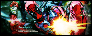
Okay so after those 2 requests I figured I'd do a few more for myself. Try some tuts etc etc. I did a few the other day and one before I started this six hour plus project. (I have no idea why it took THAT long but I guess I was slacking 40% of the time xD) The fact remains though, that I really like my outcome. This is (in my opinion) by FAR my best sig.
I actually started off with Ractchet's rikku sig tutorial but I kinda spent so much time at the lighting that I forgot I still had to go further with the tut. So in the end I finished it without having one more look at the tut xD
I hope you guys like it too (at least better than the previous 2 xD)
And I hope I got some 'depth' in it. So far I've seen several definitions of depth but I guess it was mostly the difference is sharpness and lighting.
Oh well without further ado (lol) here's the outcome.
Edit (applied some changes, still gotta take care of blue text but I need sleep too *lol*):
Last time editing (sharpened, smoothed out the blur on the right and changed the text color - still not very happy about the text, though it's better now imo)
Also I didn't look into what Miril posted yet so that'll have to wait til tomorrow evening.
^ Damn, I accidentaly took out the layer that covered the lighting on the right hand side of hinata's hair.
So if you look at it think of that to be the same as in V1 and V2
Time to hit the sack xD


 Reply With Quote