0 members and 1,168 guests
No Members online

» Site Navigation

» Stats
Members: 35,442
Threads: 103,075
Posts: 826,688
Top Poster: cc.RadillacVIII (7,429)
|
-
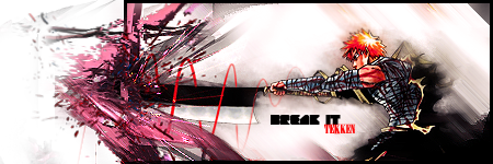
 render escaping!!! render escaping!!!
hehe just had an idea, looked nicer in my head. gonna try and clean it up so it doesnt look square on the effects side, any other suggestions?
V2:edit
Last edited by tekken; 01-18-2009 at 11:01 AM.
-
-
LIKE IMMO SAID NICE CONCEPT BROSKI
colors are odd imo and the pen tooling could do with a little work
Text needs some work as well, maybe default fonts...?  i can barely read it as is i can barely read it as is

Et Tu?
SilentShadow | Jorrne | Arcmenis | Garis | Splinter | Sanbu | DeadlesS | Tekken | Proflax | Suddu
-
-
Great concept love it.
Would only bend the top left border out a little to make it less square.
-
concepts pretty cool but execution is meh.
-
shit, I love it. A fresh take on pop out sigs.
-
Wow thats really sweet, good job thinking outside the box
-
The box thing on the right side isn't great, but the entire concept is BOSS!. 
Take away that pen tooling around the sword, it's not necessary.
Work on the background, everything else is pretty tight, the background is just a bit boring. :P
Really nice job on this one, just refine it a bit!
 Originally Posted by MarkPancake

MarkPancake banned.
Success.
-
thanks alot guys, i'll see what i can do.
Similar Threads
-
By DeadlyShadow in forum Sigs & Manips
Replies: 7
Last Post: 10-02-2008, 06:52 PM
-
By SJS91 in forum Digital Art
Replies: 4
Last Post: 01-09-2006, 10:09 PM
-
By Dj_ANTi in forum Resources
Replies: 1
Last Post: 11-14-2005, 09:18 PM
-
By dEsTRukT in forum Resources
Replies: 7
Last Post: 11-10-2005, 12:43 AM
 Posting Permissions
- You may not post new threads
- You may not post replies
- You may not post attachments
- You may not edit your posts
-
Forum Rules
|


 Reply With Quote