0 members and 634 guests
No Members online

» Site Navigation

» Stats
Members: 35,442
Threads: 103,075
Posts: 826,688
Top Poster: cc.RadillacVIII (7,429)
|
-
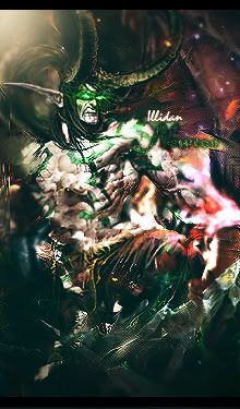
 Power Kick Power Kick
Second try at a sprite sig. God Someone pls lend me a tut so that i can make some good sprites, i really dont know how to do them. In this one there is just some mixtures of c4d's lol
CnC

Fur's Gift BOOOO EVERYONE

-
I love it the flow looks so good and IMO even the text is perfect for this sig
-
Oh WaT! I cant believe it lol, U loved my sprite? Well it must be good then 
Fur's Gift BOOOO EVERYONE
-
hmm ur capturing flow quite nicely
good work
sprites are not a personal fav.
buttt....
ur flow and text are great
keep it up.
-
I find Sprite style easier than stock style.
You get to create your own flow, etc etc.
If you asking for a TUT though i'll give a few tips i found useful when making my first one not so long ago...
Distort Filters like Shear and Ripple were useful... brush a few 50%Hardness circle and shear filter them and place them around in multiple layers. helps with flow better. Dont forget you mask off what you dont like after the filter.
Smudge ... well there's not much to be said for that. But use some soft brush smudges in the BG to get some colour variance and harder ones nearer your focus to create cleaner edges.
Colours try to use a trio of colours, when i went with too many colours i hated it, but with too little i hated it too. I used the Red - Yellow full spectrum, even etching into a tiny green tint and it looked good.
Liquify helps create easy flow, but be careful not to use too much, softly mask it off the further you get from the focus so it fades but try to create shapes at the same time, works wonders.
-
-
have a look at the tut i made, might find something useful there.
-
wow i reaaaally! like this looks perfect, deffiently the text nice!
-
this is really nice and the text fits ur sig perfectly
-
dude you nailed the text in this one and the flow is great. i peronally dont like sprite sig that much but i have to say that looks noice.
looks a tad it oversharpened imo but otherwise, listen to above c&c

Et Tu?
SilentShadow | Jorrne | Arcmenis | Garis | Splinter | Sanbu | DeadlesS | Tekken | Proflax | Suddu
-
Similar Threads
-
By BeaSt in forum Digital Art
Replies: 4
Last Post: 09-01-2007, 06:12 AM
-
By .heKtik in forum Digital Art
Replies: 2
Last Post: 06-21-2007, 07:18 PM
-
By ~FireTap in forum The Void
Replies: 11
Last Post: 12-31-2006, 10:40 AM
-
By Freak in forum Sigs & Manips
Replies: 7
Last Post: 09-20-2005, 08:36 PM
-
By Nobunaga in forum Introductions
Replies: 5
Last Post: 08-22-2005, 12:38 AM
 Posting Permissions
- You may not post new threads
- You may not post replies
- You may not post attachments
- You may not edit your posts
-
Forum Rules
|


 Reply With Quote