0 members and 817 guests
No Members online

» Site Navigation

» Stats
Members: 35,442
Threads: 103,075
Posts: 826,688
Top Poster: cc.RadillacVIII (7,429)
|
-
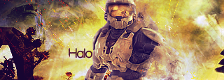
 First decent wallpaper First decent wallpaper

 i used a tut for this, i am pretty new to wallpapers. So i really loved the outcome for this, most of it is pentooling. i used a tut for this, i am pretty new to wallpapers. So i really loved the outcome for this, most of it is pentooling.
-
I'm loving EVERY thing just not the text and those arrows.
Good Job.
-
Thanks 
I think the arrows decreases the quality of this paper too. There were alot more i should have added but i really didn't feel like pentooling more of them
Text, i wanted to make it stand out more, it just blended in to much in the background without any kind of stroke or somthing.
-
Yeah, I would definitely say the surrounding elements take away from the quality of the image. Mostly because there are conflicting styles and colors used. The typography does not really seem to match the rest of the piece. The center takes on a grungy but clean appearance, and the text has another style, although grunge. Definitely a confusing color palette. :P Take out the errors and redo the typo, and this will be a fairly nice piece.
Gj overall.
-
how is this?

-
I think I know what it is. The stripes make the grunge look really weird. It's an improvement though. 
I would like to see more work done on this. I bet if you moved the heart to the side, you could throw some more on there. I like where it's going.
Last edited by Chris; 03-14-2009 at 02:46 AM.
-
It's a cool idea but i think your going about it wrong. Thing about it. That streak at the bottom of the ehart, that's for spray paint dude.
The paint spots are like paint splatters, you dont get splatters from a paint can. Unless you rly F it up before hand.
I think conceptually it just isn't working that well.
But then again im a bit biased against this cause im a bit tired of this style.
The heart is nice though you did good on that. The lines are okay but gain they make the grunge look odd. Work on your effects, maybe try to make them less uniform and addd more flow to them.
 My DevART
RATCHET is my bitch
Andrew says:
u ever stolen a bible?
Apathy says:
no
used the last two pages to roll a joint though
Andrew says:
wow
thats fucking hard core
^^HAHAHA, dm sucks XD
-
What if they spray painted it, and then dropped some paint on it?
-
Very Nice. I definitely think it's a good idea, and it looks great.
Version 2 does look like the better one because there is more of a focus on the Heart.
-
 Originally Posted by Papa

It's a cool idea but i think your going about it wrong. Thing about it. That streak at the bottom of the ehart, that's for spray paint dude.
The paint spots are like paint splatters, you dont get splatters from a paint can. Unless you rly F it up before hand.
I think conceptually it just isn't working that well.
But then again im a bit biased against this cause im a bit tired of this style.
The heart is nice though you did good on that. The lines are okay but gain they make the grunge look odd. Work on your effects, maybe try to make them less uniform and addd more flow to them.
I agree with papa on this one, i am a bit tired of seeing the brush only type of large pieces, the hearts shape and its shades arent bad, but the bg and all the brushes just seems overdone, and i think the colors could fit better, red-green not my fav. The text from version 1 to version 2 improoved big time. Keep it up dude and keep experimenting
Similar Threads
-
By Cap'n Jazz in forum Sigs & Manips
Replies: 7
Last Post: 07-17-2008, 11:17 PM
-
By Audacity in forum Digital Art
Replies: 1
Last Post: 05-26-2006, 12:32 PM
-
By GreeneBeast in forum Sigs & Manips
Replies: 4
Last Post: 09-04-2005, 05:53 PM
-
By DARKSYDE in forum Sigs & Manips
Replies: 6
Last Post: 08-27-2005, 12:16 PM
-
By Tripz in forum Sigs & Manips
Replies: 2
Last Post: 06-27-2005, 06:53 PM
 Posting Permissions
- You may not post new threads
- You may not post replies
- You may not post attachments
- You may not edit your posts
-
Forum Rules
|


 Reply With Quote