0 members and 676 guests
No Members online

» Site Navigation

» Stats
Members: 35,442
Threads: 103,075
Posts: 826,688
Top Poster: cc.RadillacVIII (7,429)
|
-
 Phzed Phzed
Hey, I'm new to the boards..
I mainly do web design, but I post in graphics forums, such as GB and Power Core.
I haven't been making tags too long, I'll post them oldest to newest.


-
Really like the second to last one. You can see improvement, nice job, you have a strange style in my opinion, keep it!
-
 Originally Posted by Splinter.

Really like the second to last one. You can see improvement, nice job, you have a strange style in my opinion, keep it!
Thanks very much.
The second to last is part of an LP I'm working on, I'll notify you when I finish it.
-
Be sure to, it looks hot man 
-
-
Your second one is probabaly your best. But watch out it gets a bit minimal at the top. I suggest you read a couple of tutorials so you can get basic BG layout and blending down pat. your pretty solid rigth now, but your styles seem extremly unique in certain areas.
Remember to follow the rule of thirds whenever possible. Also try and work your colors a it more next time.
Overall nto bad, you just need some more practice.
 My DevART
RATCHET is my bitch
Andrew says:
u ever stolen a bible?
Apathy says:
no
used the last two pages to roll a joint though
Andrew says:
wow
thats fucking hard core
^^HAHAHA, dm sucks XD
-
Originally Posted by Papa
Your second one is probabaly your best. But watch out it gets a bit minimal at the top. I suggest you read a couple of tutorials so you can get basic BG layout and blending down pat. your pretty solid rigth now, but your styles seem extremly unique in certain areas.
Remember to follow the rule of thirds whenever possible. Also try and work your colors a it more next time.
Overall nto bad, you just need some more practice.
The oldest are at the top, newest at the bottom.
I like the fact my style is unique.
Thanks for the comments 
Rule of thirds?
-
secound one is really nice. Other ones are nice.
-
second last one rocks dude u are very original in ur style , i like originality
-
Thanks for the comments.
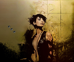
My latest:


Last edited by Phzed; 03-30-2009 at 12:04 PM.
Similar Threads
-
By Phzed in forum Digital Art
Replies: 3
Last Post: 03-29-2009, 09:49 AM
 Posting Permissions
- You may not post new threads
- You may not post replies
- You may not post attachments
- You may not edit your posts
-
Forum Rules
|


 Reply With Quote


