0 members and 535 guests
No Members online

» Site Navigation

» Stats
Members: 35,442
Threads: 103,075
Posts: 826,688
Top Poster: cc.RadillacVIII (7,429)
|
-
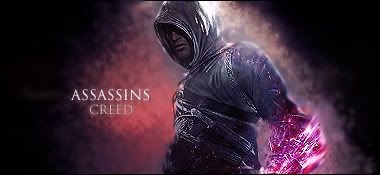
 Assassins Creed Assassins Creed
newest sig made it for battle against Garis.
what do you think!?
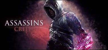
v2:

Last edited by navb01; 04-14-2009 at 02:40 AM.
-
-
thanks for the feedback!
you say smudge his left hand?
I cant even see it!
-
-
make it more about your creations, your designs and effects, than just posting a render and smudging the bg. I like what's going on with his arm.. try the clone stamp tool and some filters.. you can really get good results that way..
-
what do you mean whats going on with his arm?
and this was my first sig with doing the smudging so I wanted to try it out!
im still learning 
-
not bad, I like the colors, the text needs to be smaller, the thing with text is If you have to ruin a good sig with text make it small so it doesn't ruin it that much, unless you are really good with text. the arm pink/purple thing is cool, it does need to be blended more tho, also bg looks halfassed, try adding more smudging, diff layers, lighting variations, color variations, etc. also seems a little too contrasted on parts of the render, I would suggest bluring or burning parts that you want to be shadowed and smoothing out the parts that are bright and focal points. nice sig tho, kiu.
-
-
-
Similar Threads
-
By Benzin in forum Sigs & Manips
Replies: 5
Last Post: 07-23-2008, 12:02 PM
-
By Miha FRS in forum Sigs & Manips
Replies: 3
Last Post: 03-27-2008, 04:06 PM
-
By Ruins Of Tomorrow in forum Sigs & Manips
Replies: 2
Last Post: 05-15-2007, 05:25 PM
-
By Hip Hop in forum Sigs & Manips
Replies: 4
Last Post: 03-04-2007, 02:26 PM
-
By static in forum Digital Art
Replies: 4
Last Post: 06-28-2006, 05:56 AM
 Posting Permissions
- You may not post new threads
- You may not post replies
- You may not post attachments
- You may not edit your posts
-
Forum Rules
|


 Reply With Quote
 good idea. of course you could make it better.


