0 members and 567 guests
No Members online

» Site Navigation

» Stats

Members: 35,442
Threads: 103,075
Posts: 826,688
Top Poster: cc.RadillacVIII (7,429)
|
-
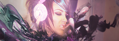
 My first sig here. My first sig here.
Alright so I read a few of the tutorials, and instead of following any of them step by step I just took what I learned from each one, and threw it all together intoooo...

CnC plz 
-

Text is pretty bad, seems pretty chaotic, and the splatters are oversharpened, but that might just be me.Colours are nice though, overall an ok signature.
"Imagination Is More Important Than Knowledge"
Latest

Favourite
 "Together We Stand Strong"
-

Text needs to be worked on. Read some text tuts on here they will help you alot. The splatter kind of ruins it for me but that my opinion. Apart from that its a decent sig. Render is good and is well positioned 
-

thanks, I'll look at some text tutorials 
I made the mistake of adding text before sharpening, so that might be part of the reason it looks so screwy :P
-

For your first thats pretty epic, it does look to "messy" fior the render, it should have been more calm so it would suit the render more 
keep itup.
-

maybe lessen the opacity on the splatter and take inner shadow off and change the font!
good job bud keep it up
-

thanks guys 
It's always nice to get helpfull comments.
-

its rather freakin awsome for a first sig but try and make ur canvas smaller and read some text tuts also u dont always have to sharpen the sig  btw need any help just ask btw need any help just ask
-

I'd cut at least 1/3 of from the left.
Work on the text and unsharpen some of the splatters because they draw attention away from the focal.
Other than that it's rather nice, great colours and some nice effects.
 Posting Permissions
- You may not post new threads
- You may not post replies
- You may not post attachments
- You may not edit your posts
-
Forum Rules
|


