0 members and 542 guests
No Members online

» Site Navigation

» Stats
Members: 35,442
Threads: 103,075
Posts: 826,688
Top Poster: cc.RadillacVIII (7,429)
|
-
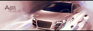
 Audi Audi
This is the first signature that I have really spent a lot of time on in a LONG time. Please tell me what you guys think, as well as which version is best. I got stumped on the sharpening. CnC welcome.
Version 1 (the one I think is best):

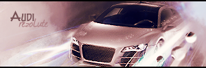
Version 2:
Version 3:
favorite:
sotw:
 rrrrreLax.Designsssss
rezoLute
 Originally Posted by Some guy off another forum...
I never said Fall Out Boy were emo, you tottering simpleton.
^i lawled^
-
I'm not sure which one between V1 and V2, I like the detail you can see on them. Nice effects used for such a small signature but it doesn't look cramp.
Text works.
-
ty ^_^ thats the best feeback i've gotten on any of my work so far 
anyone else? comments?
favorite:
sotw:
rrrrreLax.Designsssss
rezoLute
Originally Posted by Some guy off another forum...
I never said Fall Out Boy were emo, you tottering simpleton.
^i lawled^
-
its very cramped into the small space and looks over sharpened but overall it looks ok  gj gj
-
all 3 versions look over sharpened? o.0
favorite:
sotw:
rrrrreLax.Designsssss
rezoLute
Originally Posted by Some guy off another forum...
I never said Fall Out Boy were emo, you tottering simpleton.
^i lawled^
-
not so much v3 but 1 and 2 are defo over sharpened v3 a little bit
Similar Threads
-
By Fondzy in forum Sigs & Manips
Replies: 3
Last Post: 02-25-2009, 08:43 AM
-
By cc.mio in forum Sigs & Manips
Replies: 4
Last Post: 11-26-2008, 10:21 PM
-
By Garis in forum Digital Art
Replies: 8
Last Post: 11-15-2008, 12:53 PM
-
By Fork in forum Sigs & Manips
Replies: 4
Last Post: 09-15-2008, 10:40 AM
-
By Quaggy in forum Digital Art
Replies: 8
Last Post: 07-28-2007, 05:37 AM
 Posting Permissions
- You may not post new threads
- You may not post replies
- You may not post attachments
- You may not edit your posts
-
Forum Rules
|


 Reply With Quote


