0 members and 26,370 guests
No Members online

» Site Navigation

» Stats
Members: 35,442
Threads: 103,075
Posts: 826,688
Top Poster: cc.RadillacVIII (7,429)
|
-
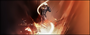
 WIP...need some suggestions WIP...need some suggestions
i need some suggestions on what to add to this. its a shirt design
Click Here for earlier version.
current version:

Last edited by rezoLute; 04-23-2009 at 01:17 PM.
Reason: updated picture
favorite:
sotw:
 rrrrreLax.Designsssss
rezoLute
 Originally Posted by Some guy off another forum...
I never said Fall Out Boy were emo, you tottering simpleton.
^i lawled^
-
I think it needs a background behind the Heart. Perhaps a place that those tentacles are coming from? some interaction?
-
mmm. ok ok. got any ideas on that though? i was sorta thinkin of adding red c4d's or sumthing
also the lines are supposed to be coming from inside of the heart.
you think i should change the drops too? change their sizes so they dont look the same.
favorite:
sotw:
rrrrreLax.Designsssss
rezoLute
Originally Posted by Some guy off another forum...
I never said Fall Out Boy were emo, you tottering simpleton.
^i lawled^
-
make the lines flow out of the heart better.. other than that it's a sick design
-
Change the drops(size), yes.
Imo it would look better it the holes wasn't blurred.
And maybe drop the red stroke on the tentacles.
Along with this, i'd say keep the colors simple.
Nice job, keep it up
-
Originally Posted by Helix

make the lines flow out of the heart better.. other than that it's a sick design
hmmmm... what do you mean?
Originally Posted by silentshadow
Change the drops(size), yes.
Imo it would look better it the holes wasn't blurred.
And maybe drop the red stroke on the tentacles.
Along with this, i'd say keep the colors simple.
Nice job, keep it up
im gonna keep the red glow on the lines. idk why i just think that it suits it. ^_^
the holes arent really blurred either, i just used a soft brush. if i should make them differently how should i do it?
favorite:
sotw:
rrrrreLax.Designsssss
rezoLute
Originally Posted by Some guy off another forum...
I never said Fall Out Boy were emo, you tottering simpleton.
^i lawled^
-
use a hard brush instead?
-
Drop your stroke size, go light on c4d if you use it. Spatter brushes would suit this if its for a shirt. Great work!
-
the blood drops look sorta blurred to me. I think u should make a blooddrop right as its going into the blood pool on the bottom. might look cool 
-
I think you should drop the glow on the tentacles, and then try making the drops more realistic, right now they seem kinda blurry. Also i would love to have another bg ? but it in some sort of contekst (dunno if thats the right word) so that it doesnt look so empty. I would create a scene, simple yearh but something more than just a white bg.
Similar Threads
-
By Fuzer in forum Sigs & Manips
Replies: 9
Last Post: 03-05-2009, 03:37 PM
-
By Wiseson in forum The Void
Replies: 11
Last Post: 09-03-2005, 02:36 AM
 Posting Permissions
- You may not post new threads
- You may not post replies
- You may not post attachments
- You may not edit your posts
-
Forum Rules
|


 Reply With Quote