0 members and 707 guests
No Members online

» Site Navigation

» Stats
Members: 35,442
Threads: 103,075
Posts: 826,688
Top Poster: cc.RadillacVIII (7,429)
|
-
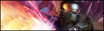
 Halo Tag CnC needed Halo Tag CnC needed
well cnc away
-
Could use some text, and the right c4d is way too obvious, but you have some nice effects going
-
sharpen the render a bit to give it some depth..
i like the color scheme and i think text would ruin it..
gj...
-
Too much going on, text needed
Ders no depth and flow
Overall i think its a decent sig
-
blend the c4d in a little more on the right and it will look wayy better!
-
no depth no flow, too much sharp.. here's what u do
sharpen master chief and blur the c4d's,
the brightness in effects takes my eyes away from the render.
Fur's Gift BOOOO EVERYONE

-
iiiiiiiiiiiiiiiiiiiiiiiiiiiiiiiiiiiiiiiiiiiiiiiiii iiiiiiiiiiiiiiiiiiiiiiiiiiiii
I Love The collors U always use 
my idol , my idol scriby
make some tut one time -.-
-
lol linda i already have a tut
-
Too much going on, the colors are wild and don't really match the render. You need some text, it's the icing on top of the cake. And your lightsource is... well, I don't like it. Nor do I like the fuzzy sharpness of the left c4d. Sorry dude, not diggin it.
-
The colours are great and the effects look good and flow well, but they don't blend with the colours of render and the render looks out of place.
Especially the little smudge off the shoulder. its just brown and ewy.
Similar Threads
-
By nyve in forum The Void
Replies: 3
Last Post: 11-01-2005, 05:12 PM
-
By starcraft in forum Sigs & Manips
Replies: 2
Last Post: 08-03-2005, 12:25 AM
-
By S-F in forum Digital Art
Replies: 6
Last Post: 07-19-2005, 03:52 PM
 Posting Permissions
- You may not post new threads
- You may not post replies
- You may not post attachments
- You may not edit your posts
-
Forum Rules
|


 Reply With Quote