0 members and 21,292 guests
No Members online

» Site Navigation

» Stats
Members: 35,442
Threads: 103,075
Posts: 826,688
Top Poster: cc.RadillacVIII (7,429)
|
-
 dead space dead space
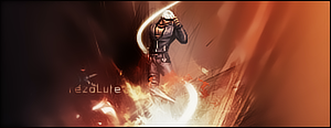
kinda monotone but overall im satisfied cnc?

-
monotone is the last thing you should worry about on this sig. text doesnt go at all. clear up the focal some more.
favorite:
sotw:
 rrrrreLax.Designsssss
rezoLute
 Originally Posted by Some guy off another forum...
I never said Fall Out Boy were emo, you tottering simpleton.
^i lawled^
-
I hope you didn't just crop this out from somewhere, add a texture and stick a text in it. Because I actually like this sig. The simplicity just works for me. I like the text, not a fan of the "YNK" though. Try adding something else in, like a meaningful quote or word that links back to the game?
Anyway, render needs to brought forth a little. Make it more eye catching, or make everything else less eye catching. Lol
Btw, awesome game, awesome graphics.
Last edited by Hind; 04-27-2009 at 12:15 PM.

Adobe Photoshop - [CS4]
Editing since April '09

-
haha that render looks awsome. Does he actually have a tower on his head or something? 
Like the others, text can use some work but overal its okay I assume.
-
lol no has 15 or so layers. Used the render and a backround from the game and manipulated it a bit. Text has always been my weak point, use ynk for short of one of my other names.
Thanks for the advice guys
-
looks good but the text doesnt fit at all. It doesnt look to montone really because teh blue fills up the space. it works with the image.
-
Looks nice. as the others have said, the text isnt great, i would remove it and just place the YNK in one of the bottom corners. btw, can we get a link to the render and stock used?
-
Very monotone, but that's alright.
Work on bringing out the focal so that it isn't blended too much with the background.
Text doesn't suit the sig, but overall it's not bad. 
Originally Posted by MarkPancake

MarkPancake banned.
Success.
-
Originally Posted by Fuzer
Looks nice. as the others have said, the text isnt great, i would remove it and just place the YNK in one of the bottom corners. btw, can we get a link to the render and stock used?

http://planetrenders.net/renders/dis...php?pos=-29613
http://www.dailygame.net/images/scre...d-space_03.jpg
Similar Threads
-
By smallboss in forum Sigs & Manips
Replies: 3
Last Post: 03-04-2009, 12:16 PM
-
By Miyagi13 in forum Sigs & Manips
Replies: 5
Last Post: 01-06-2009, 09:56 PM
-
By Firescorpio in forum Sigs & Manips
Replies: 4
Last Post: 12-13-2008, 10:31 AM
-
By ratchetnclank in forum Sigs & Manips
Replies: 11
Last Post: 08-20-2008, 01:18 AM
 Posting Permissions
- You may not post new threads
- You may not post replies
- You may not post attachments
- You may not edit your posts
-
Forum Rules
|


 Reply With Quote


