0 members and 7,814 guests
No Members online

» Site Navigation

» Stats
Members: 35,442
Threads: 103,075
Posts: 826,688
Top Poster: cc.RadillacVIII (7,429)
|
-
 Some stuff I've done. Some stuff I've done.
I did these pieces with the latest version of GIMP. The alleyway thing is for my solo metal project, Algarothsyum. The Lotus images are just something different I tried. Obviously, I posted the original of each pic, to show you what I've done with them.

Alleyway with the band logo sprayed on the wall.

Same image, but darker and more dramatic. And intentionally blurry, because I used it for the background of http://www.myspace.com/algarothsyum

The original photo. If you're curious, this was taken in Johnson City, Tennessee.

Lotus logo on the hood of an Elise.

Original.

Just an angled shot of the Lotus.

And the original. For the record - no, this is not my car, but I wish it was!
Tell me what you think. I'll post some more stuff soon. I've made a few sigs, banners and the like.
-
Some more stuff.

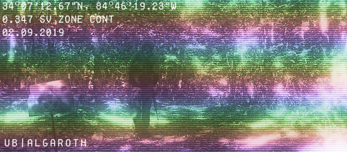
This is supposed to look like some sort of surveillance camera, looking at a lone wanderer in the woods.

Just a render of the Algarothsyum logo.

A banner, promoting it.

Another one. It was intended to be like sunset, but there's too much pink, in my opinion.

My first real render I did with GIMP. It's just straight up black metal looking, haha.
A signature I made, in the same render as the first pic in this post ("uB|Algaroth" is my screenname, in my CSS clan. Yes, I'm friggin' nerdy, so whatever)

A sig I made for someone else in the clan.
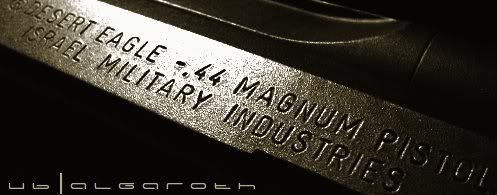
A sig I made for myself, using a photo of my old Desert Eagle .44 I used to have.

Same thing.
-
if u ask me bluntly the originals look far better than ur work, I know it sounds harsh but for me thats the truth, although i like that desert eagle sig.
Text of ur logo in ur second post is so-so.
Fur's Gift BOOOO EVERYONE

-
id say first of all to only post a few images per thread its too hard to critique it when its a ton of different things!
second the lotus logo one isnt all that great but i do like the lotus one and the wall one they look great, some really nice effects!
-
Ok. Too much stuff. Too messy. Slow down. Lol
Alright, since I'm such a nice guy, I took a look at everything a couple of times just to give you some nice opinionz.
I like what you did to the first photo, it's TOO blurred out though. I thought the Lotus logo looked pretty cool. I like the logo for your band or was it someone else's band? I forgot. Whatever, it's pretty good. That surveillance camera thing is something different and it turned out all right. I also like your second last sig, along with it's text.
It looks as though you like your work to be more, placement of renders/stocks instead of making the use of C4Ds, etc, which isn't a bad thing. I guess you could call that a style of your own. Of course, it would be good to learn how to use C4Ds and other effects in your work. Read some of the tuts here and you'll find yourself learning some useful stuff. Tbh, I think you need to work on improving your style. I like a few of your works but the others...
Anyhow, hope to see your improved style and works soon. 

Adobe Photoshop - [CS4]
Editing since April '09

-
I actually took the photographs of the lotus, and for one I probably could have photoshopped the bird-poop out of the original photo....
-
Adobe Photoshop - [CS4]
Editing since April '09
-
tutorials are the path to greatness... it sounds stupid but its how i learned
Similar Threads
-
By forever.lost in forum Sigs & Manips
Replies: 0
Last Post: 06-19-2006, 05:42 PM
-
By imported_eternity in forum Digital Art
Replies: 5
Last Post: 10-28-2005, 11:31 AM
-
By xspitfire5o3x in forum Digital Art
Replies: 1
Last Post: 10-25-2005, 10:51 PM
-
By imported_AcidGlow in forum Digital Art
Replies: 7
Last Post: 10-16-2005, 01:58 PM
-
By N8theGr8 in forum Digital Art
Replies: 8
Last Post: 09-30-2005, 01:13 AM
 Posting Permissions
- You may not post new threads
- You may not post replies
- You may not post attachments
- You may not edit your posts
-
Forum Rules
|


 Reply With Quote


