0 members and 26,370 guests
No Members online

» Site Navigation

» Stats
Members: 35,442
Threads: 103,075
Posts: 826,688
Top Poster: cc.RadillacVIII (7,429)
|
-
-

Definitely Color. I like the effects and colors and whatnot, but I don't think they match with the hulk at all. A different render would've done this the world imo. There seems to be no general flow at all either, it's just random blotches everywhere.
-
-
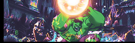
V1.
Looking forward to the remake. 
   Religion gives nothing in life, only in death.
-
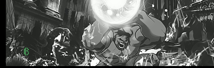
v2, black and white.
Looks waaaaaaaaay too topazed, clear that up, and you have a sick sig.
-
v1 is pretty cool. but defintly wanna ssdee the redo.
 My DevART
RATCHET is my bitch
Andrew says:
u ever stolen a bible?
Apathy says:
no
used the last two pages to roll a joint though
Andrew says:
wow
thats fucking hard core
^^HAHAHA, dm sucks XD
-
-
 Originally Posted by B

no topaz on that
oh. didnt have my glasses on,
it just doesnt look normal. was it digi painted ?
-
Similar Threads
-
By Smiling Demon in forum Digital Art
Replies: 5
Last Post: 05-20-2006, 11:24 AM
-
By Tenchido in forum Sigs & Manips
Replies: 8
Last Post: 05-18-2006, 01:30 PM
-
By ROTD in forum Sigs & Manips
Replies: 13
Last Post: 08-27-2005, 02:43 PM
-
By Daemon_ in forum The Void
Replies: 3
Last Post: 06-13-2005, 12:28 PM
-
By undertone in forum Sigs & Manips
Replies: 2
Last Post: 05-29-2005, 11:09 AM
 Posting Permissions
- You may not post new threads
- You may not post replies
- You may not post attachments
- You may not edit your posts
-
Forum Rules
|


 Reply With Quote


 bw/color are both awesome