0 members and 9,995 guests
No Members online

» Site Navigation

» Stats
Members: 35,442
Threads: 103,075
Posts: 826,688
Top Poster: cc.RadillacVIII (7,429)
|
-
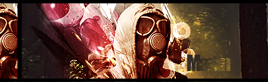
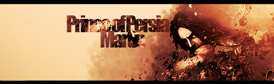
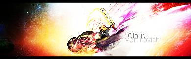
 Stalker,Forest, Random Others. Stalker,Forest, Random Others.
I tried to follow someone's tut, don't remember it.
I tried some stuff, but than I got bored, started over and began a new stylelike stuff thingie.
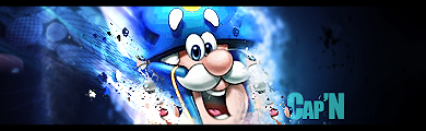
Some random others,previous work:
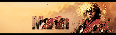
(Photomanip:)
-
-
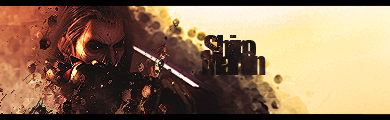
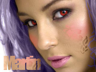
Your text seems too big and bulky in everyone. It's nice but try making it smaller so it doesn't take away attention immediately.
Edited by Ptka
Last edited by Ptka; 05-10-2009 at 01:13 PM.
Reason: Make it easier to understand the critique. :D
-
-
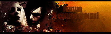
You have some pretty nice looking ones in here, lots of random artsy things going on in your sigs, but that's good, it's a different style.
I don't really like the way you duplicate the render to fill space, that doesn't always look good.
Your text is also very large and you cover up a lot of the render with effects.
So try some more subtle text and make the effects around the render instead of directly on it. 
 Originally Posted by MarkPancake

MarkPancake banned.
Success.
-
I really need to work on my text's,
Any help on that guys?
Similar Threads
-
By Lewk in forum Sigs & Manips
Replies: 6
Last Post: 03-18-2009, 02:37 PM
-
By cc.mio in forum Sigs & Manips
Replies: 2
Last Post: 12-20-2008, 11:33 AM
-
By AnseM2k in forum Sigs & Manips
Replies: 2
Last Post: 10-07-2008, 01:52 AM
-
By PuZzle in forum Sigs & Manips
Replies: 11
Last Post: 05-17-2008, 04:59 AM
-
By Juicy in forum Sigs & Manips
Replies: 7
Last Post: 08-28-2005, 01:12 AM
 Posting Permissions
- You may not post new threads
- You may not post replies
- You may not post attachments
- You may not edit your posts
-
Forum Rules
|


 Reply With Quote