0 members and 4,702 guests
No Members online

» Site Navigation

» Stats
Members: 35,442
Threads: 103,075
Posts: 826,688
Top Poster: cc.RadillacVIII (7,429)
|
-
 New Sigs/Styles again New Sigs/Styles again
Textures weren't really my thing. So I went back to C4D's and different smudge variations. I really like the outcome of these.

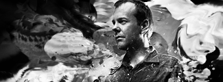
No Wireframe
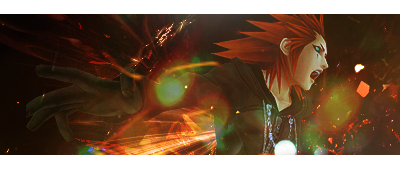
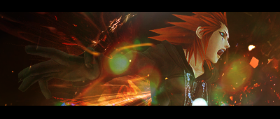
cnc
-
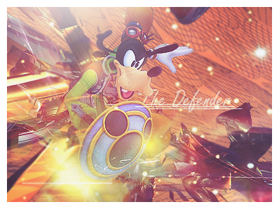
I like these two:
The second sig looks better with the border imo.
-
interesting style you have i like the b/w one for the first, and a wireframless second one, though your colours seem a little dull and boring to me, but thats just a taste thing i guess
-
 Originally Posted by Fuzer

interesting style you have i like the b/w one for the first, and a wireframless second one, though your colours seem a little dull and boring to me, but thats just a taste thing i guess
I went through a stage of big popping colors, believe it or not. This is really something that I don't normally do. =D
Thanks.
-
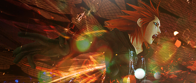
The first two signatures (Bauer) are awesome. Came out very nice.
I don't like any of the others. Lame game, dodgy lighting, and grainy in some areas.
   Religion gives nothing in life, only in death.
-
I love these man. Number 1s so hot, keep it up. The Zack render you used wasn't too good - find a better quality one 
-
Originally Posted by XaiXo
The first two signatures (Bauer) are awesome. Came out very nice.
I don't like any of the others. Lame game, dodgy lighting, and grainy in some areas.
Just because you think it's a lame game should have anything to do with it. Anyway, the bottom one's were basically just all of my C4D's being used. You should get more used to my style, because that's really how all my sigs look.
Similar Threads
-
By .exploited in forum Digital Art
Replies: 3
Last Post: 03-15-2006, 05:01 PM
-
By Crymsyn in forum Sigs & Manips
Replies: 6
Last Post: 11-27-2005, 06:34 PM
-
By gunz in forum Sigs & Manips
Replies: 3
Last Post: 11-16-2005, 11:29 PM
-
By Effekt in forum Digital Art
Replies: 7
Last Post: 07-25-2005, 11:26 AM
 Posting Permissions
- You may not post new threads
- You may not post replies
- You may not post attachments
- You may not edit your posts
-
Forum Rules
|


 Reply With Quote


