0 members and 26,370 guests
No Members online

» Site Navigation

» Stats
Members: 35,442
Threads: 103,075
Posts: 826,688
Top Poster: cc.RadillacVIII (7,429)
|
-
 SOTW ENTRY - SNOWISMYGOD. SOTW ENTRY - SNOWISMYGOD.
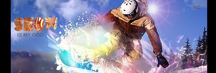
CnC please. About one and a half hours work. My first signature using my trial version of CS4, it is one million times better than 7.0 which is what i have been using.
Also, I would like to thank Flatty for inspiring the snowboard theme. Thanks mate.
-
Pretty awesome, good flow, colors are beautiful,
Except for the lightning/text.
Plus, at his right leg it's a bit too busy.
Overall -7/10.
Btw, just get a dam cracked cs4 version (:
-
yea i wanted a sort of explosionj of colour at his leg, i like explosions in a tag
i didnt think the text was too bad tbh but everyone has an opinion
Thanks or the comment, it much appreciated
btw wheres the lightning?:S
-
nice work with the c4d's scribby! just the text sux
cool work XD
Fur's Gift BOOOO EVERYONE

-
Effects on the bottom right are quite cool. The ones by his feet I'm not too keen on. It looks like a big splatter brush, and there's a bright white light omitting from the center of them which is so attention grabbing it's annoying. Text is way too big and doesn't fit in with the color scheme or effects imo. I know you liked it in Flattys piece but it kills it for me. Lighting seems way off,the piece had natural lighting on it and you've overdone it a bit. Don't like the lens flare either.
-
ok thx for the comments
-
Sorry if I'm late, but the only thing I don't like is the lens flare by the renders head, it really takes away from it.
Other than that, good job.
-
Sorry man. Not working for me. I usually like most of your work but this just isn't working out. The colours seem very random and don't blend in with the sig as a whole at all. That lens flare behind him is just plain distracting, and it just looks kinda weird. The snow in this is pretty bad as well. One thing I do like about this is the C4D work at the bottom left area of the sig.

Adobe Photoshop - [CS4]
Editing since April '09

-
the border is kinda thick, and the colours in the text doesnt really fit, the "AC" has been placed awfully.
I like the effects used and the colours though 
-
 Originally Posted by マーティン

Pretty awesome, good flow, colors are beautiful,
Except for the lightning/text.
Plus, at his right leg it's a bit too busy.
Overall -7/10.
Btw, just get a dam cracked cs4 version (:
Do not discuss Piracy
Similar Threads
-
By KidBuu in forum Sigs & Manips
Replies: 2
Last Post: 02-03-2009, 03:04 AM
-
By G®èñådè in forum Sigs & Manips
Replies: 3
Last Post: 10-16-2005, 10:40 PM
-
By RoughDraft in forum Sigs & Manips
Replies: 22
Last Post: 09-04-2005, 10:35 AM
-
By Deadloader in forum Sigs & Manips
Replies: 16
Last Post: 07-31-2005, 06:31 AM
-
By Deadloader in forum Sigs & Manips
Replies: 2
Last Post: 07-30-2005, 12:56 PM
 Posting Permissions
- You may not post new threads
- You may not post replies
- You may not post attachments
- You may not edit your posts
-
Forum Rules
|


 Reply With Quote