0 members and 474 guests
No Members online

» Site Navigation

» Stats
Members: 35,442
Threads: 103,075
Posts: 826,688
Top Poster: cc.RadillacVIII (7,429)
|
View Poll Results: winner?
- Voters
- 33. You may not vote on this poll
-
 Garis vs. Lewk Garis vs. Lewk
Hello.
Vote vote vote.
I want to see views equal to votes 
Garis

Lewk

-
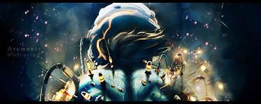
Garis gmv. Cleaner, Lewks was too black and I couldn't really see what he was trying to point out.
-
 Originally Posted by Splinter.

Garis gmv. Cleaner, Lewks was too black and I couldn't really see what he was trying to point out.
that the stock is pwnage 
-
Lewk...
garis it's a bit blury and too much empty space/white going on...
it'd look better with stronger colors...
-
i was dropping by and xD lewk asked me to say somthing and vote probably o.o
hey everyone o.o xD
and i will base mmy vote on my new criteria to evaluate a piece
1. message
none gets my vote i'd like to see more message into the work a more clear sence of direction that makes the viewer feel like they could connect in some way to the piece (yeah i know its a fucking sig but then again its me isnt it?)
2. tehcnique.
both have a clean cut tehcnique and are soothing to the eye both have a different approach and good use of elements. i will go with garis on this one because i can clearly see the process of work involved and the cleaness and refined use of effects.
3. composition
again both of them share a similar composition centered focal point with adjacent elemnts to bring forth the central element.
garis has a more smart use of the negative space which in lewks there is a bit of a flaw in the brightness which comes across a bit bland crispier black and a more lean white would've doen the trick to bring forth the entity of the boat. so this round Garis takes my vote.
4. text and message.
the use on typography on both of the signatures is accurate nothing out of the box or peculiarly outsandingly different or bold but well played on the safe side, both suppoert the theme of the work but i will go with lewk's since it has more of a direct and clear significance, its just THE BOAT nothing more
as for garis "through struggle" doesn't really go with the whole color scheme and technique of the piece through struggle is obviously represents the physiical struggle of the character but, makes the colors and elements contradict the theme.
so on this round lewk gets my vote
5. overall perception
at first glance garis signature catches the eye for graphcial impact, as lewks has more of a subtle tough to it. both of them have great quality and i like them both. both have a different aproach and make for a nice competition. so both of them get my vote
overal resutl garis 3 lewk 2
newest:

Fav :

The true and only Firescorpio!
(no autographs please)
-
Haha I can't really compete with El Fire's detailed analysis of the sigs, but I simply just liked Lewk's better, I think the stock is amazing, and he did a good job with it.
Garis, the only real thing that I hated about yours was the text, it's blah!
Originally Posted by MarkPancake
MarkPancake banned.
Success.
-
-
lewk, felt the same as deadless
-

Adobe Photoshop - [CS4]
Editing since April '09

-
Had to go with lewk this round. That boat sig is just awesome, Good job to the both of yous
   <--Click baby eggs please! <--Click baby eggs please!
Similar Threads
-
By Lewk in forum Signature Tutorials
Replies: 35
Last Post: 08-09-2011, 09:41 AM
-
By Lewk in forum Sigs & Manips
Replies: 6
Last Post: 11-30-2008, 10:16 AM
-
By Lewk in forum Sigs & Manips
Replies: 4
Last Post: 08-28-2008, 01:06 PM
-
By Lewk in forum Sigs & Manips
Replies: 3
Last Post: 07-15-2008, 05:09 PM
-
By Lewk in forum Sigs & Manips
Replies: 2
Last Post: 06-22-2008, 03:58 AM
 Posting Permissions
- You may not post new threads
- You may not post replies
- You may not post attachments
- You may not edit your posts
-
Forum Rules
|


 Reply With Quote