GFXVoid Graphic Design Forum

Remove Text Formatting
Loading...

» Online Users: 3,270

0 members and 3,270 guests
No Members online

» Site Navigation

 > FAQ

» Stats

Members: 35,442
Threads: 103,075
Posts: 826,688
Top Poster: cc.RadillacVIII (7,429)
Welcome to our newest member, Lekelindids
Page 1 of 2 12 LastLast
Results 1 to 10 of 11

Thread: been

  1. #1
    Join Date
    Sep 2005
    Location
    Florida
    Posts
    349

    Default been

    bored and trying different shit.


    Tantum religio potuit suadere malorum.
    (To such heights of evil are men driven by religion) -Lucretius, De Rerum Natura


  2. #2
    Join Date
    Oct 2007
    Posts
    2,782

    Default

    Top and pedo bear tags are hawt!!


  3. #3
    Join Date
    Jan 2009
    Location
    Scotland
    Posts
    2,772

    Default

    YEA!!! awsome work dude

  4. #4

    Default

    i like the last 1, it the focal stood out more it would be pimp.
    .:Latest:.
    Gifts:
    - [Groo] [-] [-] [-] -


  5. #5
    Join Date
    Jul 2008
    Location
    Vancity, Canada
    Posts
    2,985

    Default

    Quote Originally Posted by tekken View Post
    i like the last 1, it the focal stood out more it would be pimp.
    Totally agree, if there was possibly a light source, a faint one at that, but a light source, and then you made the focal more recognizable, this one would be win.
    Quote Originally Posted by MarkPancake View Post
    MarkPancake banned.
    Success.

  6. #6
    Join Date
    Sep 2005
    Location
    Florida
    Posts
    349

    Default

    last was hard to do since the background was very 2d and the image was from a really shiny glaussy wallpaper, bit i will try and make it work a bit more thx.


    Tantum religio potuit suadere malorum.
    (To such heights of evil are men driven by religion) -Lucretius, De Rerum Natura


  7. #7
    Join Date
    Jul 2008
    Location
    Vancity, Canada
    Posts
    2,985

    Default

    On that last one, you could also crop a bit of that left side, it is a VERY long sig.
    Quote Originally Posted by MarkPancake View Post
    MarkPancake banned.
    Success.

  8. #8
    Join Date
    Sep 2008
    Location
    England
    Posts
    1,459

    Default

    Nah the left side adds substance, it's needed in this I reckon.

    Thats hot...

  9. #9
    Join Date
    Jul 2008
    Location
    Vancity, Canada
    Posts
    2,985

    Default

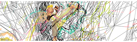
    Not a fan of that one.
    The wire frames are good to an extent, and then they just get cluttered.
    I also don't really like the fact that the render doesn't fit with the rest, it looks quite out of place, and very covered up by those effects in an effort to make it blend in.
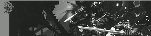
    The black one is still my favourite.
    Quote Originally Posted by MarkPancake View Post
    MarkPancake banned.
    Success.

  10. #10
    Join Date
    Aug 2008
    Location
    The netherlands
    Posts
    903

    Default

    Love them al exept for that sprite dude
    not feeling that one, the rest is freakin amazing

    WHAT'S THIS?! A SIGNATURE?

Posting Permissions

  • You may not post new threads
  • You may not post replies
  • You may not post attachments
  • You may not edit your posts
  •  
Powered by vBadvanced CMPS v4.1.1