0 members and 688 guests
No Members online

» Site Navigation

» Stats

Members: 35,442
Threads: 103,075
Posts: 826,688
Top Poster: cc.RadillacVIII (7,429)
|
-
 Oh dear.. Oh dear..
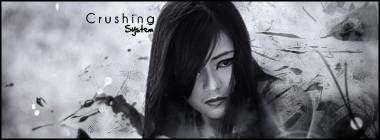
Hey guys. After a LONG time of not using photoshop I gave it a little play around today with my first ever stock. 
Don't really like it though to be honest, I didn't really know what to do but I thought I should share it with you all anyway.
I couldn't get rid of the text in the top left corner, it was part of the stock. Can that be changed or not?
Version 1:

Version 2 (Black and white):

Comments/Critique please?  Be nice. <3 Be nice. <3
-

Use an erased, or clone stamp. anyways it's not bad, coloring needs work. the bubble C4Ds should be set to screen tbh man, dont like them as just normal bubbles. needs more effects in the foreground and bg. not bad for a return though, nice one.
-

Set to a screen in the layer options? And as for clone stamp just clone the background? Thanks for the comment.  Which do you prefer? Black/White or coloured? Which do you prefer? Black/White or coloured?
-

I like it, gonna use that stock in my next sig, but I really like it.
Erase over the focal point man and you're good to go!
Synsational: "I got so many products in my hair that your Anus hair would probably smooth out too. You'd end up getting a job modeling ass hair for Tres Emme."
-

I like it very much to be honest. The flow is perking, not to mention the effect C4Ds you used are epic! You might want to erase over the focal but even so it'll still be epic IMO. The text is placed too far, not to mention it sorta sucks. Sorta spoils it but its all cool, lol.
 Originally Posted by Slave
takken, you sweet boy you, i could eat you 6^
-

I never chose the text, it's part of the stock, I don't know how to remove it. :| Thanks for the comments though, means a lot considering I've not touched it in a few weeks.
-

when i use a stock, i usually duplicate them a lot, smudge the last layer then erase until the focal point can be seen...
-

Okay, I manged to get rid of the text and put my own text in but now I think it looks empty. What should I add?
Version 3:

-

postion the text on the middle left rather in the lower left to fill the space?
-

You mean like this?
Version 4:

Similar Threads
-
By LoganGFX in forum Sigs & Manips
Replies: 4
Last Post: 07-28-2007, 06:34 AM
-
By Xtremerunnerars in forum Sigs & Manips
Replies: 1
Last Post: 03-26-2006, 09:54 AM
-
By Slim in forum Digital Art
Replies: 9
Last Post: 01-18-2006, 10:14 AM
 Posting Permissions
- You may not post new threads
- You may not post replies
- You may not post attachments
- You may not edit your posts
-
Forum Rules
|

Be nice. <3


 Reply With Quote
 Which do you prefer? Black/White or coloured?
![[system]'s Avatar](image.php?u=21561&dateline=1231635610)


