0 members and 9,355 guests
No Members online

» Site Navigation

» Stats
Members: 35,442
Threads: 103,075
Posts: 826,688
Top Poster: cc.RadillacVIII (7,429)
|
-
-

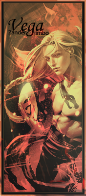
Pretty good, the only nitpick is that the text needs work and should be behind his head.

WetWorks
[system]|DoubleForte|TheFallen|Funndoo|Dungus|Chidori|Ritz |Unit_Number_43|Demon4|Kallen
-
-
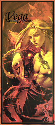
Looks better already 
WetWorks
[system]|DoubleForte|TheFallen|Funndoo|Dungus|Chidori|Ritz |Unit_Number_43|Demon4|Kallen
-
-
-
Ditch the orange border. Looks better with just one.
-
I like it, but the text needs some work, even with the adjustment already made.
-
would you say that the font should be changed or more of the placement? this is is pissing me off and i just want to get it right so i can retire for tonight >_<

XBL GT: iTz DoCiLe < add me if you play halo or just wanna be a boss !
-
 Originally Posted by Zander

would you say that the font should be changed or more of the placement? this is is pissing me off and i just want to get it right so i can retire for tonight >_<
Ha, sorry if I'm causing more work for you. I don't think you necessarily have to change the actual font. I'd play around with the placement and/or color of the text.
I mean, you don't even have to change it, it's a good sig as is. I just wanted to point out something that I would change had it been my sig.
Similar Threads
-
By The Fallen in forum Sigs & Manips
Replies: 14
Last Post: 06-05-2009, 05:34 AM
-
By tekken in forum Sigs & Manips
Replies: 5
Last Post: 04-20-2009, 01:16 PM
-
By xZero in forum Sigs & Manips
Replies: 3
Last Post: 04-11-2007, 03:14 PM
-
By Riddleb0x in forum Sigs & Manips
Replies: 5
Last Post: 11-30-2006, 02:04 PM
-
By rchocobo in forum Sigs & Manips
Replies: 9
Last Post: 08-30-2005, 03:51 PM
 Posting Permissions
- You may not post new threads
- You may not post replies
- You may not post attachments
- You may not edit your posts
-
Forum Rules
|


 Reply With Quote

 fankkssss