0 members and 962 guests
No Members online

» Site Navigation

» Stats

Members: 35,442
Threads: 103,075
Posts: 826,688
Top Poster: cc.RadillacVIII (7,429)
|
-
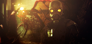
 Another one, not quite as good. Another one, not quite as good.
I'm now officially hooked on Photoshop. I can't stop making these now, I just love it. Soon this forum will be taken over by my tags haha!
Anyways, not quite as good as my previous ones in my opinion but I've used the same C4D's in all of them as I haven't got loads, next tag will be different though; I just downloaded 250+ more of the things!

Comments/Critique please? 
-

BG and render seem a bit LQ, left side is empty.

WetWorks
[system]|DoubleForte|TheFallen|Funndoo|Dungus|Chidori|Ritz |Unit_Number_43|Demon4|Kallen
-

The render isn't low quality? Oh well, that's your opinion.  Thanks for the comment, this render was harder to work with as it was darker meaning a darker background. I'm working on another one now! haha! Thanks for the comment, this render was harder to work with as it was darker meaning a darker background. I'm working on another one now! haha! 
-

The background is just a little bit boring, it's still pretty good though.
The lighting is slightly off with the person, there isn't really a defined light source.
Good blending and colours however, this is pretty original. 
 Originally Posted by MarkPancake

MarkPancake banned.
Success.
-

id say left side is cool, id add a brighter cliping mask on "dccarnage" text (try to clip that green/yellow part of the sig  ) and maybe lower opacity a bit, now its too dark on already dark BG imo ) and maybe lower opacity a bit, now its too dark on already dark BG imo
im not sure about an orange part of c4d in the right, guess it dont fit in the color scheme, overall a nice tag mate 
-

Yeah, I might try again with this render, I didn't have enough C4D's, I should have downloaded some before I started making this. So after I finished making this I went to deviantart and downloaded loads of the damn things! Expect an update. 
-

not bad, you don't want to get stuck in one style tho, try alot of diff tuts and combine effects from each one in your work so its getting better and different each time. this style is neat tho, keep improving man u are already getting way better. imo.
-

Thanks Domino; just out of curiousity what do you think I should try next? I find background are really hard to make because it's hard to mix things and get it to look good.
-

search for smudge tuts and try smudging out, creating bg by smudging always looks good, grab a good colorful stock that has some color that matches your render and smudge it till it is unrecognizable then add on layers of c4d, shadows and texture, and you can branch out from there with c4d smudge, grunge brushing and smudge, then there is vector brushing, vector pentooling, gradient maps. just experiment with bgs you will find something that suits u eventually no doubt.
-

the effects are good if u remove the coloring, i relly dont think dark purple looks good here, try desaturating the purple and erase some bubble c4d, i bet it will be better that way 
Keep up the good work 
Fur's Gift BOOOO EVERYONE

Similar Threads
-
By stev0 in forum Introductions
Replies: 2
Last Post: 03-17-2007, 03:16 AM
-
By Ragidy_man in forum Digital Art
Replies: 3
Last Post: 10-23-2005, 09:56 AM
-
By Love. in forum Introductions
Replies: 2
Last Post: 10-22-2005, 04:20 PM
-
By phatso in forum Sigs & Manips
Replies: 5
Last Post: 07-24-2005, 06:45 PM
 Posting Permissions
- You may not post new threads
- You may not post replies
- You may not post attachments
- You may not edit your posts
-
Forum Rules
|


 Reply With Quote


 ) and maybe lower opacity a bit, now its too dark on already dark BG imo


