0 members and 1,535 guests
No Members online

» Site Navigation

» Stats
Members: 35,442
Threads: 103,075
Posts: 826,688
Top Poster: cc.RadillacVIII (7,429)
|
-
 Some new stuff. Some new stuff.
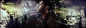
Ok so, I've made 3 new sigs. I've been trying to keep things less chaotic. I'm still far from perfect, so any help is appreciated 


-
First two are good, but the third is a bit too busy for me. Text needs work too. Well done in any case.

WetWorks
[system]|DoubleForte|TheFallen|Funndoo|Dungus|Chidori|Ritz |Unit_Number_43|Demon4|Kallen
-
The second one is awesome, lots of stuff going on, but it's still got a good focal.
My tip for you would be to tone some things down, make your sigs a bit bigger, and just make sure that things go there because they have a purpose, not just to fill up space.
 Originally Posted by MarkPancake

MarkPancake banned.
Success.
-
I agree that the first two are good. The third one has way too much going on.
-
Third one I can barely see the render. Your text needs work but you'll get there. Keep practicing. 
-
Thanks. I'll keep working on text. On the second, that c4d all the way to the left was put there to fill out some space, since otherwise, it would be black there and I didn't see it working out so well. So any tips on getting rid of unfilled space that doesn't go well with the sig? Or should I just leave it?
Similar Threads
-
By Aqueous Transmission in forum Digital Art
Replies: 4
Last Post: 06-06-2007, 02:49 AM
-
By Einsturzende in forum Digital Art
Replies: 4
Last Post: 06-04-2007, 03:13 PM
-
By +s9.Oath in forum Sigs & Manips
Replies: 1
Last Post: 06-21-2006, 09:15 AM
-
By forever.lost in forum Sigs & Manips
Replies: 0
Last Post: 06-19-2006, 05:42 PM
-
By Sonixx in forum Digital Art
Replies: 5
Last Post: 10-29-2005, 09:40 AM
 Posting Permissions
- You may not post new threads
- You may not post replies
- You may not post attachments
- You may not edit your posts
-
Forum Rules
|


 Reply With Quote


