0 members and 1,447 guests
No Members online

» Site Navigation

» Stats
Members: 35,442
Threads: 103,075
Posts: 826,688
Top Poster: cc.RadillacVIII (7,429)
|
-
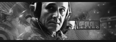
 Feeeel Electro Feeeel Electro
Hey all,some of my new stuff 

v2
v3

CnC plix ;p
Last edited by Dron; 06-18-2009 at 05:11 AM.
-
Colour for sure, looks pretty good, I just don't like the extra box.
The scan lines at the top aren't working, but at the bottom they are alright.
Just needs more flow, it's a bit random right now.
 Originally Posted by MarkPancake

MarkPancake banned.
Success.
-
ty for comment!
ill try to fix it tommorow, bit too late for meh already 
-
i wood agree with pt here
-
wow defo the colour version. Really nice colours there and use of brushes/effects. But that box looks bad, which ruins it.
Think you can beat my brutes?
-
Have to agree with ptka here, the extra box bugs me. Looks good otherwise!

WetWorks
[system]|DoubleForte|TheFallen|Funndoo|Dungus|Chidori|Ritz |Unit_Number_43|Demon4|Kallen
-
v2 added in 1st post
-
Really the coloured version, but those little dots distract me and the box too. Could use a lightsource,
Recent Work:
TRANSFORMERSSSS!

 Mortal KOMBAAAT Mortal KOMBAAAT

-
Dont know about the text. in V3 its way over topazed.
but I see big improvment in you :]]
-
Hot colours, text is weird though, try a more normal font.
Similar Threads
-
By JoKeRsWiSeHaT in forum Digital Art
Replies: 2
Last Post: 09-06-2007, 05:01 AM
 Posting Permissions
- You may not post new threads
- You may not post replies
- You may not post attachments
- You may not edit your posts
-
Forum Rules
|


 Reply With Quote


