0 members and 425 guests
No Members online

» Site Navigation

» Stats
Members: 35,442
Threads: 103,075
Posts: 826,688
Top Poster: cc.RadillacVIII (7,429)
|
-
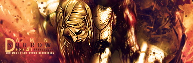
 Knight Knight
Fooled around with an old concept.
It was lying around unfinished, just fooled around with it.

-
meh the text just really destroys it for me
otherwise the effects are real good, always love your stuff man 

Et Tu?
SilentShadow | Jorrne | Arcmenis | Garis | Splinter | Sanbu | DeadlesS | Tekken | Proflax | Suddu
-
-
A bit simpler
the knight text isn't doin it for me
but I like the flow and blending
Good shit as usual
Keep em comin'
-
i would agree with the above, KNIGHT font is bit out of concept lol, lovely lightning and effect tho
-
i like it, but i dont like the knight text O.o
-
Get rid of that text! Nice sig.
-
The text is absolutely horrible xD but your effects are absolutely awesome. Cool smudging. I definitely want to see a tutorial Immo.
 Originally Posted by Slave
takken, you sweet boy you, i could eat you 6^
-
Yeah tutorial that smudging, its awesome. Its hard to see a focal point but the tag itself pulls you in to see more. Text is too pixelated... don't know if you meant to do that :P
-
The smudging isn't bad, but the text is clearly the focal.
All of the text doesn't look that good to me, and I think that there should be more of a render and less of smudgy-ness. 
Originally Posted by MarkPancake

MarkPancake banned.
Success.
-
I'll post a v2 soon with better textXD
thnx for the comments guys, i'll try to get crackin on a tut.
Similar Threads
-
By Paraphrased in forum Sigs & Manips
Replies: 11
Last Post: 02-02-2009, 12:01 AM
-
By VoodooGypsy in forum Sigs & Manips
Replies: 4
Last Post: 05-02-2007, 02:41 AM
-
By Wolf in forum Sigs & Manips
Replies: 7
Last Post: 02-11-2007, 10:44 PM
-
By YellowSubmarine in forum Digital Art
Replies: 9
Last Post: 02-03-2006, 09:29 AM
-
By Lumix in forum Digital Art
Replies: 3
Last Post: 07-02-2005, 11:21 AM
 Posting Permissions
- You may not post new threads
- You may not post replies
- You may not post attachments
- You may not edit your posts
-
Forum Rules
|


 Reply With Quote