0 members and 3,387 guests
No Members online

» Site Navigation

» Stats

Members: 35,442
Threads: 103,075
Posts: 826,688
Top Poster: cc.RadillacVIII (7,429)
|
-
 Techno CA :D Linda's return [ again ^^ ] Techno CA :D Linda's return [ again ^^ ]
hehe, i didnt make siggs for while  i was kinda "gone" a little. i was kinda "gone" a little.
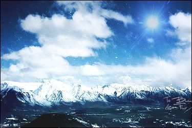
but here is my new work, i like it much , but i know i will have much of critics, still. CNC
v1.

v2

v3 [not the best one]

-

I like it Linda. It has a nice colour scheme that isn't montone, the C4D placement is great and the text looks good. Great job. 
-
-

Just one thing I forgot to add; considering you've not used Photoshop in a while you've still produced a great piece. Do you still use tutorials for C4D placement and backgrounds; if so I'd like the link if possible please? I struggle with good backgrounds. :/
-

 Originally Posted by dccarnage

Just one thing I forgot to add; considering you've not used Photoshop in a while you've still produced a great piece. Do you still use tutorials for C4D placement and backgrounds; if so I'd like the link if possible please? I struggle with good backgrounds. :/
hihihi , ididnt use any tuts 
this is my made , i mean , one day when i downloaded 10000 c4d's,
this style came up to me,no tuts 
but about c4d placement u can find good tut
BAB made, but its hard , ididnt try it yet,
but my tip - just dwd meny meny c4d's [ pm me , i will give you the greatest site ever ] and then just try pue them on pictures like "free transform"
dublicate and move more , erase some parts , and voila , in the end add grad.maps and photo filter for colour!  i like to add bubbles, and voila. i like to add bubbles, and voila.
anyways imma make TUT really soon 
and You can learn from it!
-

aha 
thanks.
the "depth" hmm
i think this sig dont need it 
i mean like
"apply image - blur"
hide
"apply image - sharpen"
erase some stuff?
here its not needed.. then i should blurr all the c4d?
its my style  its wild and crazy! get use to it its wild and crazy! get use to it 
-

This is one of your best Lin. Love it! The colour and blending is perfect! Your placement is friggin, absufucking-tastic! This is one of your, if not your biggest advantage: Blending N' C4D placement. Great work!!
 Originally Posted by Slave
takken, you sweet boy you, i could eat you 6^
-

awwwwwwwww
THANK YOU SO MUCH!  yay yay
-

wht was that 2 huge post suddenly linda 
anyways the focal is nice, the c4d placement is nice, but the sig is flowing out i mean in the center where it should hve more effects, its empty, try to cover it up,
i love ur tags already 
here's a bit of advice: All c4d's arnt suited for linear dodge.
Fur's Gift BOOOO EVERYONE

-

Awesome Sig! I love your C4D styles. They feel so natural and the colours always look great.
I do agree with the others that this is one of your best so far. 
Similar Threads
-
By john316 in forum Sigs & Manips
Replies: 9
Last Post: 03-04-2009, 09:22 PM
-
By Silviajdm in forum Digital Art
Replies: 2
Last Post: 09-11-2007, 02:58 AM
-
By imported_HatedLegend in forum Digital Art
Replies: 5
Last Post: 09-17-2005, 10:56 AM
-
By kompakt in forum The Void
Replies: 38
Last Post: 07-24-2005, 03:27 AM
-
By MartinBabies in forum Digital Art
Replies: 12
Last Post: 05-02-2005, 04:47 PM
 Posting Permissions
- You may not post new threads
- You may not post replies
- You may not post attachments
- You may not edit your posts
-
Forum Rules
|
i was kinda "gone" a little.


