0 members and 6,852 guests
No Members online

» Site Navigation

» Stats
Members: 35,442
Threads: 103,075
Posts: 826,688
Top Poster: cc.RadillacVIII (7,429)
|
-
 Showcase Showcase

Edit:
Border on the first pic
Very Simple AVA


Program Template.

Signatures:
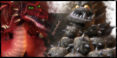
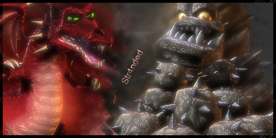
EW THE Bground on the Dragon Vs Rock looked SO much better on HF's Grey Bground
Edit: Here
Last edited by Str4nded; 07-02-2009 at 09:04 PM.
Reason: I needed to add more signatures you gotta problem? :P
-
Bump I still want CnC no matter how much my signatures suck :P.
-
haha i wouldn't say they suck man
you do have room for improvement, but i see some attempts at blending, depth, text (hate text), and the beginnings of some effects
there's so many here that i cant C&C each individually, but I will say you should check out some tuts and then put up one or two sigs at a time so they can be properly critiqued

Et Tu?
SilentShadow | Jorrne | Arcmenis | Garis | Splinter | Sanbu | DeadlesS | Tekken | Proflax | Suddu
-
-
I've been doing gfx for a very little time just wanted to show what I had.. I do want this to have CnC maybe not all at the same time though.
PS. I ussualy do very simple and nice text.. I was experimenting.
-
Ok, I'll C&C the first:
There's no blending at all, you need to blend your focal. Smudging/filters/effects can do this.
Colors are dull, but not bad
Depth is nonexistent, blurring/sharpening/burning/dodging/smudging/gradient maps/curves/brightness+contrast... there's a hundred ways to do this
The render is too big for the canvas, I don't really like it at all personally, you cant add many effects to it as is
text shouldn't be shoved in a corner like that, use a different font, and dont use those blending options
the border on the second one... dont use blending options on borders
I see no real effects, its a render slapped on a bg, you should check out some tuts and see how to create some really neat effects
When I said "(hate text)" I meant that as in... I hate text, though you do need to work on it, I recommend Papa's text tutorial.
You should check out some tutorials, like I said... they're really helpful, we all do them, no matter how experienced we are. We can't all think of every style, that's what tuts exist for, so we can learn other styles and techniques
Et Tu?
SilentShadow | Jorrne | Arcmenis | Garis | Splinter | Sanbu | DeadlesS | Tekken | Proflax | Suddu
-
-
Thanks I will take that in mind.
-
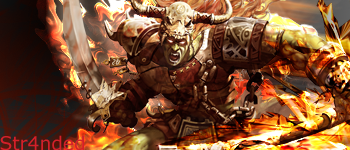
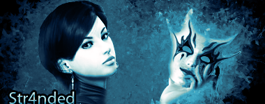
^this one is too simple, there are very little effects, and the edges of the render are not blended in enough, causing it to look cut and pasted. also it doesn't look like you did anything besides a bg and a render, also the text is bad, font is not the greatest, and your text placement is bad, generally text in the corners is a bad idea, try somewhere near your focal point like near the eyes and not covering your focal point.
^ same thing with the text here, corner text = bad text placement. effects are getting better here, still kinda messy and oversharpened. there is just too much goin on in this sig, there is no central focal point for the eyes to gravitate to. Also your edges of the render need to be blended in better here, try using the blur tool, and slightly blurring the edges of the render, also blend the bg in with the render so that it feels like it belongs. Using colors from your render in the bg and foreground effects will also help tie the effects to your sig.
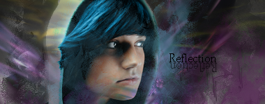
^text placement is 90% better in this one, the reflection is backwards tho dunno if that is what u intended, but it does not reflect what is written there, unless there is an invisible mirror or something, it just looks wierd like that, your effects and blending are better in this one, but still need lots of cleaning up. Your focal point of the eyes are a little messy, try erasing with a soft brush on the effect layer over the eyes and maybe on some of the hair. Try adding some depth here by sharpening parts of the hair that are sticking out, and blurring parts that are further back. There is very little flow in this sig, your effects should compliment your focal's flow. ie: your render is looking to the right, but the hair is flowing to the left so your effects should either go from left to right, or right to left up to you.
Edit:
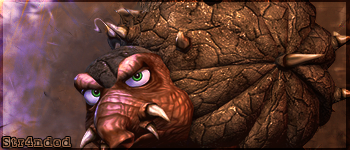
^dissapointing that this one is so close to being ok, the text looks bad like that, looks too crammed in. the bg is jacked up with that black box thing in there, and your two focal points are too messy and lq that it is not appealing to view. The border layer should always be on top of your effects unless you are doin a popout sig which this isn't, the blurred effect you got goin on here is nice tho, just clean up the focal areas and your blending is better on this one also.
Border on the first pic
^again same as said above, only the border should be your top layer, and the right side of the border is bigger than the left side, top, and bottom.
Very Simple AVA
^too simple, nice and clean, but not much to look at.
^ blending of the car is bad, take the c4d thing behind the car out it is just messing up any flow you might have here. the red things on right also seem out of place, might want to add some diff effects here, or search google for a car sig tutorial.
Program Template.
^probably the best thing you have in this post here, but it also needs to be blended in a little better, looks like a render slapped on a picture, if you made the bg, then it is not too bad.
Signatures:
^not too bad, effects are better, some blending done, could do more around facial areas. no depth, and by that I mean it appears flat, the nose should be looking closer to you than the cheek, and hair should look closer in front part of head than in the back, also try using the burn and dodge tools to create some light and shadows to help with the depth, follow what your render allready has and enhance the lighting. text placement again is bad in the corner like that, also font doesn't fit the theme.
EW THE Bground on the Dragon Vs Rock looked SO much better on HF's Grey Bground
Edit: Here
^ much better with the box thing fixed, the text placement still is bad, and the depth is lacking because all of it is at same level of lighting and shadows.
hope this helps.
Similar Threads
-
By imported_bAy in forum Sigs & Manips
Replies: 1
Last Post: 10-28-2006, 01:57 PM
-
By Nephilim in forum Sigs & Manips
Replies: 6
Last Post: 10-15-2006, 01:22 PM
-
By Sobek in forum The Void
Replies: 38
Last Post: 09-25-2005, 06:26 PM
-
By Efficio in forum Sigs & Manips
Replies: 6
Last Post: 09-02-2005, 09:56 PM
 Posting Permissions
- You may not post new threads
- You may not post replies
- You may not post attachments
- You may not edit your posts
-
Forum Rules
|


 Reply With Quote

