0 members and 1,221 guests
No Members online

» Site Navigation

» Stats
Members: 35,442
Threads: 103,075
Posts: 826,688
Top Poster: cc.RadillacVIII (7,429)
|
-
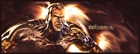
 Just messing around.. Just messing around..
Eh, just messing around with a chalk brush
Its a blah sig but if anyone wants it as a gift, go ahead and ask.
-
The effects in the first one are on! The flow is excellent and the depth ain'too shabby. Coulda used the dodge tool a tad bit in some areas where the colours are dull. The focal is great, though it seems a bit vivid, and if I may say, a bit strectched. Not completely sure though. The text ain't too bad and it looks quite good I say, though you could do without the stroke and the outer glow. Nice piece of work mate, keep trying.
 Originally Posted by Slave
takken, you sweet boy you, i could eat you 6^
-
hmm. Not a horrible tag but i'm with you it could use some touchups.
First thing i notice is you oversharpened the render a lot. Tone that down. Make it not so sharp so it doesn't have that pixelly looking edge.
Secondly it needs to be blended more. I like the smudgeing in your BG just overlap it ontop of the edges of your render a bti that way it blends in more.
The coloring is cool, and the effects are too IMO i would ave liked to see a few more spots of sharp effects these look a bit too smooth but not bad.
text isnt bad. I dislike the outer glow though and instead of the gradient looking metal typa blending options, i'd have rather like dot see just a flat color maybe a red or a gray or somehting.
overall not bad 
 My DevART
RATCHET is my bitch
Andrew says:
u ever stolen a bible?
Apathy says:
no
used the last two pages to roll a joint though
Andrew says:
wow
thats fucking hard core
^^HAHAHA, dm sucks XD
-
I really like your use of colour, the depth is good. You've done a good job imo with the text. Although papa is a better critique than me 
-
Thanks all. I honestly did this while talking to a friend about a collab, just messing around with stuff as I switched from photoshop to msn.
Never expected anything great from it.
As for the sharpness, I guess the stock I used gave it that feeling as I did not sharpen.
Guess no one wants it as a gift lol, I could have thrown someone's name in there.
This was the sig after about 20 min if anyone cares lol. Had no intention of smudging at the time.

-
Originally Posted by bmwmatt

I really like your use of colour, the depth is good. You've done a good job imo with the text. Although papa is a better critique than me
*Pretending to be affronted* Hey, what about me?:P
Originally Posted by Slave
takken, you sweet boy you, i could eat you 6^
Similar Threads
-
By Adam in forum Digital Art
Replies: 3
Last Post: 11-22-2006, 10:27 PM
-
By Nightfire in forum Digital Art
Replies: 0
Last Post: 10-18-2006, 02:26 AM
-
By Adam in forum Sigs & Manips
Replies: 6
Last Post: 04-23-2006, 05:54 PM
-
By delerium in forum Digital Art
Replies: 4
Last Post: 07-20-2005, 05:26 PM
-
By MiNdFrEaK in forum Sigs & Manips
Replies: 5
Last Post: 05-08-2005, 04:23 AM
 Posting Permissions
- You may not post new threads
- You may not post replies
- You may not post attachments
- You may not edit your posts
-
Forum Rules
|


 Reply With Quote


