0 members and 26,370 guests
No Members online

» Site Navigation

» Stats
Members: 35,442
Threads: 103,075
Posts: 826,688
Top Poster: cc.RadillacVIII (7,429)
|
-
 clan weblayout clan weblayout
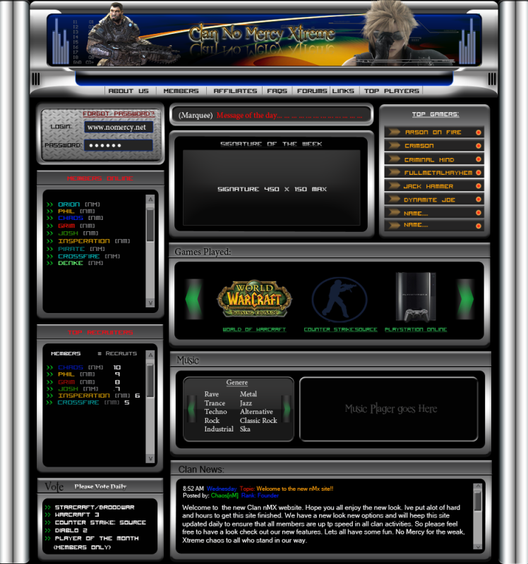
i did this a couple of weeks ago.. maybe some thoughts on this.
-
I'll post some critique on this later.
-
i think its alright for a clan layout umm i dont like how the heads of the 2 renders go thru the boarder of the banner thats not sapose to happen but as far as everything else it works for a clan site imo the great Solaris will give you better feedback on this 
-
the banner and renders can be changed i just did it for a different look..
-
Okay, as always please keep an open mind as you read through my comments. Articles that will help you beyond the scope of this critique are bolded and underlined, so be sure you watch out for those and take some time to look through all of them. I would not suggest something that would not help you in some way.
I've looked over your layout, and I'm certain you have the potential to be a great designer, although there are a lot of weak points in your style and overall execution. Hopefully my comments will help you better understand some of the principles that you will need in future work. And thanks for contributing your work to the void!
1. Based on the first thing I looked at, which was your header, I can tell that you're having alot of trouble getting a consistent style throughout your layout. I can argue that this is probably one of the most difficult concepts to incorporate into web design, but it's one of the most important. Inspiration gets easier and easier to come by, and if you check out designmeltdown, they have an archive of hundreds of websites that are broken down into categories by type and by purpose. I find that looking at other sites that have similar objectives as the layout im doing helps me gain an understand of what the overall layout should exemplify. Designmeltdown is a resource I use every single day. Find a style you're comfortable with, and stick with it until you are confident that you can use it again when needed. However, don't get stuck on a certain style. Your best weapon is diversity, and creating layouts that look the same will only hurt your ability to learn down the road. Always strive for more.
2. The layout is very cramped, and you don't leave alot of whitespace or negative space around your elements. This gives the content a very tight appearance, and it makes for a confusing design. Users can't focus on the important parts of the design, and as a result, it makes for a poor user experience. Give your content room to breathe! Module sites like this one can be nice and tidy, and the best way to achieve that effectiveness is by designing on a grid. Also take a look at the article I posted in the web development section entitled "The Grid". There are many many uses that accompany developing via a grid. Arguably so, the purposes in which a grid can be useful are great and many, but the best way to teach yourself to leave room for all the elements in your design is by starting off with a grid. If you aren't accustomed to using a grid to guide your work, try buying some graph paper, and do wireframes on those before you ever start working in photoshop. It will help you get a feel for the space between things, and it will add consistency to your finished product. Once you've got a good handle on whitespace, you may not ever need grids again, but it's never a bad idea for any project.
3. Typography is a very weak point in this design. The reason I say that is because I see at least 6 different typefaces being used. This is another area where consistency is important. If users can't read your content, they will lose interest in what you're trying to put out, and they will leave, probably for good. So it's always a good idea to constrict yourself to a few choice fonts. Alessandro Segilini put together an excellent cheat sheet for figuring out what fonts fix well, and which ones don't. What you have to remember when in photoshop, you may have 3000 fonts, but there are only a handful that work safely for the web, so you need to be conscious of the fonts you're using. If you aren't certain what fonts are safe for web use, check out this site for help. The other element of typography that seems to be hurting your design is the color you use in the text. While color is good in many respects, and making things stand out based on importance, you shouldn't be using more than 2-3 different colors, at the very most 4 on your entire page. Doing so will cause confusion about which parts are more important than others, and it leads to confusion. Sticking to a palette both with your design as well as your typography is a great way to accomplish consistency. Check out adobe.kuler if you need ideas on what colors mix well using color theory.
4. Diversity of content and styling of elements. While I understand that this is a clan layout, and there's probably alot of information you may want presented on the first page visitors come to, this is an old way of thinking. Put yourself in the user's shoes, and imagine you have no idea what any of this content means or what it does. Putting the most important things first is your number one instinct, so go with it. For elements that don't require so much attention, save those for pages that are more relevant. Prioritizing your content and equally balancing them between each of your pages will help you develop a more sound design, and it will ensure that content isn't lopsided; oftentimes you will see sites with a ton of content on the front page, but none anywhere else. This is something that happens alot with clan sites and gaming communities. The need or want to present everything at once. The other point is your styling. I understand this may be a result of inexperience, but you should try to ensure that each of your sections compliment the overall style or design of the layout. For instance, the "games played" section doesn't correlate at all with the "login" section. You could say that both are slotted for different purposes, but there should be elements that carry over. Repeating elements where suitable is a great way to help users grow accustomed to your site. The best way to ensure that you do this is to pick a particular style, and stick with it throughout the entire process. Again, design meltdown can help you greatly in this respect.
If you have any questions, or you need further guidance, feel free to ask and I will do my best to help you. There are also many others here who can guide you on your way to becoming a better designer. Again, thanks for sharing your work, and I hope I helped you today! Don't forget to apply what you've learned and show us what you come up with!
Last edited by Chris; 07-21-2009 at 08:02 PM.
-
TX for the info you have been more help then any other forums.. And your right for my inexperience in designing i push to make the most appealing project that i can imagine.. i know this layout needs some work im just trying to get a feel for it trying to learn as i go along.. its a project i do when i dont work.. so i try to learn and do what i can with the resources i have.. i appreciate all your incite you have given me.. .. Now that being said if i give the PSD can we make this a GFX project to make changes and maybe see what we can do to improve it.. GFX can use the project after for w/e if you want to code it slice it etc etc .. Like ClanTemplates.. Its up to you guys.. i have the PSD ready to DL..
-
You should see if you can work on some of the issues I pointed out, like typography and color before you get to the slicing part. I am willing to help you, but I'd rather the layout be more presentable before I start trying to figure out how it's going to be coded.
-
im not worried about the slicing and coding.. but i wouldnt mind making this a web chain project for GFX.. And see other members ideas and differences.. The text i know needs to be fixed.. This is just a learning project.. when i get time i can work on fixing the issues.. And the PSD is all organzied for easy change so wouldnt take me long...
-
Okay
-
http://www.filefactory.com/file/ahde...mplateVer2_psd
theres the link for it if you wanna give it a shot..
Similar Threads
-
By Syforce in forum Digital Art
Replies: 6
Last Post: 05-07-2006, 12:56 AM
-
By PenguinElitist in forum The Void
Replies: 20
Last Post: 06-22-2005, 08:52 PM
 Posting Permissions
- You may not post new threads
- You may not post replies
- You may not post attachments
- You may not edit your posts
-
Forum Rules
|


 Reply With Quote


