0 members and 19,645 guests
No Members online

» Site Navigation

» Stats

Members: 35,442
Threads: 103,075
Posts: 826,688
Top Poster: cc.RadillacVIII (7,429)
|
-
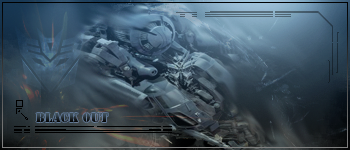
 Blackout Sig Blackout Sig
ok just trying to work on my blending skills more using some tutorials.. so go easy on me lol..

-

i like this one wd mate 
-

TY!! its not the best brushing and smudge but im trying to learn more...
-

the symbol would be better of not ther. the font is weird try down sizing it. but the like the way the text is there is cool. right corner im not likeing the tech thingy.
but i like it good job
-

really good blended..
even overblended.. I dont see what the focal is..
remove that transformers logo from the BG/..
that way you will get good techie/abstract tag 
-

as Garis said, can't see the focal, try working on the overall compo and how to present your focal. nice idea to go with the tech brushes for the render.
-

TY for going easy on me lol.. still a novice but i will get there eventually..
-

That's got some good technique, but not my style.
As a whole sig, it doesn't really work, but some of the components are well done.
Smudging is great, if not overdone, so just make sure you smudge less. 
Lighting is very soft which is great for something like this.
Nice colours and I actually see some flow.
Basically the border and the text are killing this one, the techy borders almost never look good unless heavily stylized, and the text is just really big.
Try to use the default fonts and don't put any layer styles on them, keep it clean.
 Originally Posted by MarkPancake

MarkPancake banned.
Success.
-

I agree with Ptka on this one. With a less overpowering border, this one would look quite nice.
The Smudging and C4D placements are also pretty nice and the sig looks pretty cool. 
Similar Threads
-
Replies: 1
Last Post: 08-05-2006, 06:40 AM
 Posting Permissions
- You may not post new threads
- You may not post replies
- You may not post attachments
- You may not edit your posts
-
Forum Rules
|


