0 members and 1,982 guests
No Members online

» Site Navigation

» Stats
Members: 35,442
Threads: 103,075
Posts: 826,688
Top Poster: cc.RadillacVIII (7,429)
|
-
 Cus Dom. told me to post it here.. >_> Cus Dom. told me to post it here.. >_>
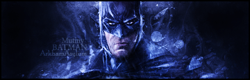
I posted it on another forum, and Dom told me to post it here, lol. Got mostly fair comments on the other forum, I don't like the text though. Anyway, C&C. 
-
Not much of a fan of the darkness and yes the text needs work but everything else is pretty nice  keep it up keep it up
-
its alright man its way too dark tho and looks blurry to me keep workin tho man
-
 Originally Posted by Muffun

Not much of a fan of the darkness and yes the text needs work but everything else is pretty nice keep it up
Thanks
Originally Posted by UnDeRoAtH
its alright man its way too dark tho and looks blurry to me keep workin tho man
Yeah, my laptop screen has a really high brightness level and when I turn it down once, it ends up too dark. So, everything I design looks fine on here but looks darker and more contrasted on monitors. Stupid laptop. :P
-
I got points for you
there not meant to make fun of you or to bring u down , they're for help
1.monotone = bleh
2. i cant see the text and its nasty
3. theres no flow its just like there yah know
4. Either the lighting is wack or you just didnt do any im not sure
5. left and right looks weird cus its just black and empty
6. and theres no depth AT ALL
good thing is though u have some good effects u just need to add more elements to the tag
like depth and what not
good work though
-
It's not a bad tag. The main thing that stands out to me is the text, but you know that yourself. It could do with a little more colour, it's a bit monotone. Other than that, it's a pretty decent sig. Keep it up. =)
-
Originally Posted by Shane.
I got points for you
there not meant to make fun of you or to bring u down , they're for help
1.monotone = bleh
2. i cant see the text and its nasty
3. theres no flow its just like there yah know
4. Either the lighting is wack or you just didnt do any im not sure
5. left and right looks weird cus its just black and empty
6. and theres no depth AT ALL
good thing is though u have some good effects u just need to add more elements to the tag
like depth and what not
good work though
Underlined for the lulz. All my signatures end up monotone, although I've been completely sure what it means. Does it mean dull, washed and boring? 
And thanks!
Originally Posted by Shannon Apple
It's not a bad tag. The main thing that stands out to me is the text, but you know that yourself. It could do with a little more colour, it's a bit monotone. Other than that, it's a pretty decent sig. Keep it up. =)
Thanks.
-
depth= 3d form kind of
im not looking it up im telling u my definition of it
like the way light is on an object to give it a 3d form on a 2d surface
so like that bat man has no lighting giving it very bad depth
does that kind of help
if u want just look up depth i dont know it word for word but i know what it is
im not good at explaining lol
Similar Threads
-
By xZero in forum Sigs & Manips
Replies: 5
Last Post: 04-08-2007, 03:24 PM
-
By Fire Monk in forum Sigs & Manips
Replies: 3
Last Post: 02-13-2006, 09:43 PM
-
By unit_number_43 in forum The Void
Replies: 22
Last Post: 08-26-2005, 06:25 PM
-
By AKH|Arazand in forum Digital Art
Replies: 4
Last Post: 08-16-2005, 12:16 PM
-
By halcEh in forum Introductions
Replies: 17
Last Post: 05-09-2005, 08:18 PM
 Posting Permissions
- You may not post new threads
- You may not post replies
- You may not post attachments
- You may not edit your posts
-
Forum Rules
|


 Reply With Quote


