0 members and 8,657 guests
No Members online

» Site Navigation

» Stats
Members: 35,442
Threads: 103,075
Posts: 826,688
Top Poster: cc.RadillacVIII (7,429)
|
-
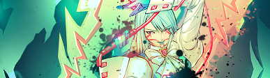
 sotw enteh sotw enteh
Last edited by .blueflare; 09-13-2009 at 08:42 PM.
-
Sexy. I like the second to last and the last the most.
-
Contrasting colors in the first three are very nice. Last two the colors are still nice, but not as much. Not a huge fan of how the text is done, and the blue bar on the left only makes sense with the color scheme in the last two.
Thus, I'd pick the second one with a suggestion of adding text, just perhaps with a different colored backdrop on the text.
Currently Playing ~ Outwar | Team Fortress 2 | OGame ~ If you play Outwar or OGame, or would like to start, message me.
-
i like the bluer ones, the other ones feel little like theres just a bit too much saturation. for me, the lighter blues make it feel cleaner and newer almost. i love the cleaness of this sig, theres not to much fading and stuff and it still looks great. the only thing i have to say about improvement, is that i lose track of her body when i look away from her face, maybe its just the render being confusing or something, maybe its cause i'm feverish and tired... idk xD but good job 
-
v4 is the best  i love the text lol i love the text lol
-
Good job blue flare.
I like it all but the text though, I think a different font would suit it.
Gj anyway. 
-
text could do with a little sorting but otherwise its good
My Newest
Making A Tutorial: Off Mail me if you wanna collaberate.
-
second version is my favorite!
Similar Threads
-
By Oblivion in forum SOTW Voting
Replies: 20
Last Post: 11-09-2005, 09:02 PM
-
By Freak in forum Sigs & Manips
Replies: 4
Last Post: 11-04-2005, 09:52 AM
 Posting Permissions
- You may not post new threads
- You may not post replies
- You may not post attachments
- You may not edit your posts
-
Forum Rules
|


 Reply With Quote


