0 members and 2,560 guests
No Members online

» Site Navigation

» Stats
Members: 35,442
Threads: 103,075
Posts: 826,688
Top Poster: cc.RadillacVIII (7,429)
|
-

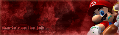
hello ppl... i've just made a mario sig and want some coments and criticism please provide the following:
1)C&C
2)marks out of 10
3)things i should do to make it better (be specific)
4)is it better than my current signature?

thank you ppl
-

The mario needs to stand out more and be the centerpeice. And the colours kinda clash. I like the text but i don't think it looks so good in the centre.
8/10 - could get a 9 if the mario stood out a bit more , after all it's a mario sig 
Hmm it's hard to say , touch the mario one up a bit and it'll be better.
-
The colors dont match mario. Make it a nice red or blue... then it will suit him better... text is a little in a random spot too. Make it in the lower left or somwhere in that area.
Oblivion

-
i brought out mario a little bit... i'm gonna try changin the color....
-
how's this
-
I liked the green one better. I dont know. The clashing seemed to take my eye to Mario. I really enjoyed the green one, although I think Mario could stand to pop out a little more. And he could look nicer in the center, or a little more closer to it.
7.5/10 only cause I think the green one kicked more ass.
-
second one looks a whole lot better,
1) looks pretty good, but your mario doesnt stand out enough, it seems like render like that do not look as good blended but rather "unblended"
2)7/10 (cool background, but very simple)
3) unblend mario, stick just him there and dont worry about blending, basically, stick him on. you text looks pretty cool, and so is your background, but i dont know that a grunge background goes well with a mario pic.
4) stick with your current, its awesome.
-
I'm sorry but I still think the green one was better. Mario seems lost in the red one because he matches so well. I liked the way that he stood out on the green one, I just didnt like how he was hidden on the right side. But I agree about not having him blend in. Make him stand out!
-
ok, thanx for the comments... i'm gonna un-blend mario....
-
Mario is a bright , colourful character. And you have him portrayed as dark and almost evil * dun dun dun! * , you should try a brighter background maybe...
Similar Threads
-
By Nashwin in forum Sigs & Manips
Replies: 1
Last Post: 07-12-2006, 06:48 AM
-
By Zeyne in forum Sigs & Manips
Replies: 6
Last Post: 11-22-2005, 10:15 PM
-
By Freak in forum Sigs & Manips
Replies: 4
Last Post: 11-04-2005, 08:51 AM
-
By DragonsRage in forum Sigs & Manips
Replies: 12
Last Post: 08-29-2005, 04:59 PM
-
By ghetto fab in forum Sigs & Manips
Replies: 3
Last Post: 02-13-2005, 08:07 PM
 Posting Permissions
- You may not post new threads
- You may not post replies
- You may not post attachments
- You may not edit your posts
-
Forum Rules
|


 Reply With Quote


