0 members and 6,970 guests
No Members online

» Site Navigation

» Stats
Members: 35,442
Threads: 103,075
Posts: 826,688
Top Poster: cc.RadillacVIII (7,429)
|
-
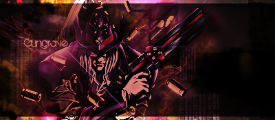
 Brush and Smush :3 Brush and Smush :3
Tried something new, not perfect but I enjoyed messing with the smudge tool 
C&C much appreciated. 
-
The effects are awesome! Smudging is awesome! text is Great! renders is Badass! But i`d try to get some c4d`s on it to bring lightning and a bid of depth. every thing is great but the lightning is a bit off thought.
You should definitelly make a tutorial
-
the smudging is very well done can u send me the settings u used? its very pro looking but execution could use some tampering with. agreed with the depth and lighting etc etc
-
Love it awesome smuge work! But would agree with gielke10 the lighting and depth isn't really there.
What font is that btw? I need some new fonts ")
-
 Originally Posted by gielke10

The effects are awesome! Smudging is awesome! text is Great! renders is Badass! But i`d try to get some c4d`s on it to bring lightning and a bid of depth. every thing is great but the lightning is a bit off thought.
You should definitelly make a tutorial
I can link you to the tutorial I got the idea from if you want? It's on another forum :P
Originally Posted by .blueflare
the smudging is very well done can u send me the settings u used? its very pro looking but execution could use some tampering with. agreed with the depth and lighting etc etc
I used default settings on just regular brushing. I just clicked and dragged And thanks
Originally Posted by Confusiion
Love it awesome smuge work! But would agree with gielke10 the lighting and depth isn't really there.
What font is that btw? I need some new fonts
Thanks
I don't know, I downloaded a huge font pack of about 5000 fonts from another website. So, I don't know the fonts in specific. I'll tell you tommorow the names. It's too late to get my lappy all fired up
-
yeah id love 2 
-
Loving the smudging. Really nice.
Mutiny prefers not to use C4D's don't you matey. 
But I agree with Gielike - Good text, good smudging, good flow, good placement and the whole composition of the piece. Get some more depth in there though.
-
-
C4D's hate me.
Yeah, some depth would be NICE mate.
Originally Posted by greekfreak5
one word Bravo
Thanks!!
-
looks rather monotonous where its all brown and black,
Try mixing some other colours in there, a few bits of red, orange or yellow would go well.
Best wishes, Luke.
Similar Threads
-
By Jr. Shinobi in forum Resources
Replies: 4
Last Post: 04-02-2006, 11:31 AM
-
By famgy in forum Resources
Replies: 2
Last Post: 07-09-2005, 12:30 AM
-
By n2u400 in forum Digital Art
Replies: 3
Last Post: 07-08-2005, 06:04 PM
-
By Chaos in forum The Void
Replies: 1
Last Post: 06-25-2005, 09:03 PM
 Posting Permissions
- You may not post new threads
- You may not post replies
- You may not post attachments
- You may not edit your posts
-
Forum Rules
|


 Reply With Quote