0 members and 848 guests
No Members online

» Site Navigation

» Stats
Members: 35,442
Threads: 103,075
Posts: 826,688
Top Poster: cc.RadillacVIII (7,429)
|
-
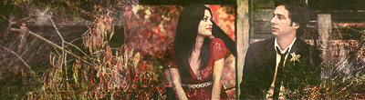
 2nd Attemp. Going no where? 2nd Attemp. Going no where?

What u think then guys? am i going forwards or backwards?
-
i love it  you got great depth in this signature and the effects are really nice. keep up the good work you got great depth in this signature and the effects are really nice. keep up the good work
-
C4ds are too messy I think. Looks like you just threw a bunch in there and called it a day. Try using just a few at a time. Contrast also looks too high.
-
the effects are a little messy, and the render to me ruins the flow of this tag, and i agree that it is alittle over contrasted, keep workin at it.
In all deepest reality, we may only imagine the days past us, knowing that anything and all happens; and time will never be written until the happening... The future is 'eXcellence'.
eXx
-
TY guys, It's only my second sprite so i'm still learning ^^.
Anyone else got anything to add?
-
-
i love the colours, and i think that with a larger focus object, your background would look great. i've never worked with sprites, i actually hate working with c4ds and stuff like that, but i kinda feel like the biggest issue people have with sprites is finding the balance between having enough stuff going on that its not boring, and having too much stuff going on, so that the sprite gets overpowered and lost. maybe i'm wrong, i really wouldnt ever know, but i feel like thats a real problem with sprite sigs. from what i can see, your current signature has found the perfect balance (the one under all your posts) but this one you just did is really overpowered by both the background colours and the background lighting.
summary: i love the placement, i love the colours, and i love the flow, just cant keep track of the sprite. make the sprite the focus of the sig, and it'll be perfect.
-
-
very gaotic, colors are all over the place, the blue of her hair could have been used for instance. also the sig is to large compared to the focal, crop it down to maybe 2/3 or so? The flames are to bright they overpower the focal... needs a lot off work imo.
-
The only reason i did it was really to see whether my first one was a one off, which aprantly it was lol. ty for the comments guys
Similar Threads
-
By Daemon in forum Digital Art
Replies: 8
Last Post: 01-27-2009, 08:33 PM
-
By Oblivion in forum Digital Art
Replies: 7
Last Post: 03-25-2005, 11:35 PM
 Posting Permissions
- You may not post new threads
- You may not post replies
- You may not post attachments
- You may not edit your posts
-
Forum Rules
|


 Reply With Quote