0 members and 11,032 guests
No Members online

» Site Navigation

» Stats
Members: 35,442
Threads: 103,075
Posts: 826,688
Top Poster: cc.RadillacVIII (7,429)
|
-
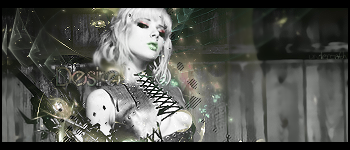
 Desire Tag SOTW entry Desire Tag SOTW entry
i havent been makin anything good lately but i tried something different and this is what i came up with i had to stop 3 times to step away and finish it lol and i just finished it like 2 mins ago 
so what ya think ?
-
It looks really messy around the render, but it seems to work. Also, love the text placement. Good job!
Last edited by Dom; 10-09-2009 at 12:42 AM.
-
yeah its messy but i think it does work cause when i took some off it looked funny hahah since her arm comes up behind that stuff hahaa thx alot
need more color thats all you have to say ??
-
I dislike the text,the placement is good but the text is kinda,meh the color doesnt work :/
-
 Originally Posted by UnDeRoAtH

need more color thats all you have to say ??
Okay, then i should repeat that the tag is quite messy and the text is adding to it.Lightning could be better, darken the BG.
-
Originally Posted by UnDeRoAtH
yeah its messy but i think it does work cause when i took some off it looked funny hahah since her arm comes up behind that stuff hahaa thx alot
need more color thats all you have to say ??
Sorry, I had to run off to school, earlier! I think it could use a bit more red.
-
I quite like it, like the colours around the focal and the placement. Bit empty on the right hand side though. Hate the desire text. Not bad overall, keep it up.
-
text is rubbish and whored but it's placement is good, i also like the blobby scanlines, if there was a tad more colour, it could be better
My Newest
Making A Tutorial: Off Mail me if you wanna collaberate.
-
omg i love the object focus, i hate the background! xDD lol i love love love the way you added some colour, and the balance looks great, but the background completely ruins it for me. its way too out of focus, and compaired to the object focus, its really bland in colour and it drags your gaze away from the intended point
-
looks really good, love the text, Font?
Similar Threads
-
By Scrib in forum Sigs & Manips
Replies: 14
Last Post: 04-05-2009, 07:18 AM
-
By trend in forum Sigs & Manips
Replies: 6
Last Post: 04-01-2009, 11:12 PM
-
By zole in forum Sigs & Manips
Replies: 1
Last Post: 03-30-2009, 08:15 PM
-
By Dreiko Shadrack in forum Sigs & Manips
Replies: 5
Last Post: 11-22-2006, 07:42 AM
-
By Adam in forum Sigs & Manips
Replies: 6
Last Post: 07-21-2005, 09:59 AM
 Posting Permissions
- You may not post new threads
- You may not post replies
- You may not post attachments
- You may not edit your posts
-
Forum Rules
|


 Reply With Quote


