0 members and 770 guests
No Members online

» Site Navigation

» Stats
Members: 35,442
Threads: 103,075
Posts: 826,688
Top Poster: cc.RadillacVIII (7,429)
|
-
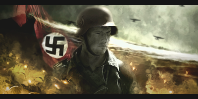
 Soldier Soldier
was in a mood to make sig today lol, even though im kinda done with this stuff, ima prolly gona make a sig or 2 from time to time just not to forget photoshop completely 
P.S. No, im not a nazi or stuff, i just got respect for german military XD
anyways heres wut i got:
-
The seconds looks sexy. The rest looks good. 10/10
-
the first one looks great, although i feel like the soldier didnt need to fade towards the bottom quite as much, but its fine the way it is  i dont know what there is to respect about the german army any more than any other army in the world, but uhm ok i'll go with it... swastika seems a little unnecessary but lol its your choice. i dont know what there is to respect about the german army any more than any other army in the world, but uhm ok i'll go with it... swastika seems a little unnecessary but lol its your choice.
i dont like the second one as much actually, i dont like the text for one thing, and the object focus seems really out of place. the colours also dont blend very well and the style doesnt match perfectly, but all these are just a little ways off from being great
the third looks pretty good, the colours match well and the overall theme looks good.
1: 7.5/10
2: 6/10
3: 8/10
-
i feel like that white smokey line in the bg doesn't really belong. other than that everything is good flow
-
It might look better if u made the entire thing B/W apart from the Nazi flag? I think that would help the stock blend better not just create a cool effect.
Similar Threads
-
By Conflict39 in forum Digital Art
Replies: 1
Last Post: 08-21-2006, 10:54 AM
-
By deathrow_ in forum Digital Art
Replies: 3
Last Post: 01-14-2006, 11:49 PM
-
By Virus™ in forum Digital Art
Replies: 3
Last Post: 09-30-2005, 03:25 PM
-
By navy in forum Digital Art
Replies: 10
Last Post: 09-24-2005, 09:28 PM
-
By ion5 in forum Digital Art
Replies: 7
Last Post: 09-18-2005, 01:04 AM
 Posting Permissions
- You may not post new threads
- You may not post replies
- You may not post attachments
- You may not edit your posts
-
Forum Rules
|


 Reply With Quote


