0 members and 382 guests
No Members online

» Site Navigation

» Stats
Members: 35,442
Threads: 103,075
Posts: 826,688
Top Poster: cc.RadillacVIII (7,429)
|
-
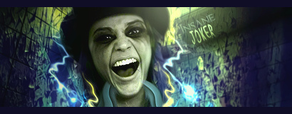
 Insane Joker Insane Joker
-
not my fav from you dron. the joker text is pretty nice, but im not feeling the insane text. render is creepy, lol, i dont like the border change the color and make it smaller. effect are nice, but not as many as we normally see from you. i think this is the first time you have gotten the lighting wrong, lol, it should be coming from the bottom part of the sig under her face. depth is fantastic.
great work man, not as amazing as some of your others, but still nice
-
Nice work dron, indeed i am feeling it. do make an update as the Kritez suggests LEt me see the change 
Good one! Keep posting
"You can delay but time will not"
-
Nice.
The white-ish effects on both sides of character are almost identical on both sides, probably vary 1 of them a bit to create more dynamic look.
The darkening on the left side is a bit forced IMO. The borderline of it is completely vertical, which kind of looks a bit fake. A curved/tilted line would look slightly better, I think.
Similar Threads
-
By MrInsane in forum The Void
Replies: 4
Last Post: 10-07-2009, 05:37 PM
-
By KidBuu in forum Sigs & Manips
Replies: 11
Last Post: 01-10-2009, 03:39 AM
-
By +mw.kira in forum Resources
Replies: 0
Last Post: 01-16-2008, 01:44 AM
-
By .exploited in forum Digital Art
Replies: 2
Last Post: 11-14-2005, 09:48 PM
-
By Gazo in forum Digital Art
Replies: 2
Last Post: 10-04-2005, 02:48 AM
 Posting Permissions
- You may not post new threads
- You may not post replies
- You may not post attachments
- You may not edit your posts
-
Forum Rules
|


 Reply With Quote


