GFXVoid Graphic Design Forum

Remove Text Formatting
Loading...

» Online Users: 532

0 members and 532 guests
No Members online

» Site Navigation

 > FAQ

» Stats

Members: 35,442
Threads: 103,075
Posts: 826,688
Top Poster: cc.RadillacVIII (7,429)
Welcome to our newest member, Lekelindids
Results 1 to 4 of 4

Thread: Nikeeeezzz.

  1. #1

    Default Nikeeeezzz.


    First large work ever.

    Comment and Critique, thanks.

  2. #2
    Join Date
    Sep 2008
    Location
    Australia
    Posts
    2,310

    Default

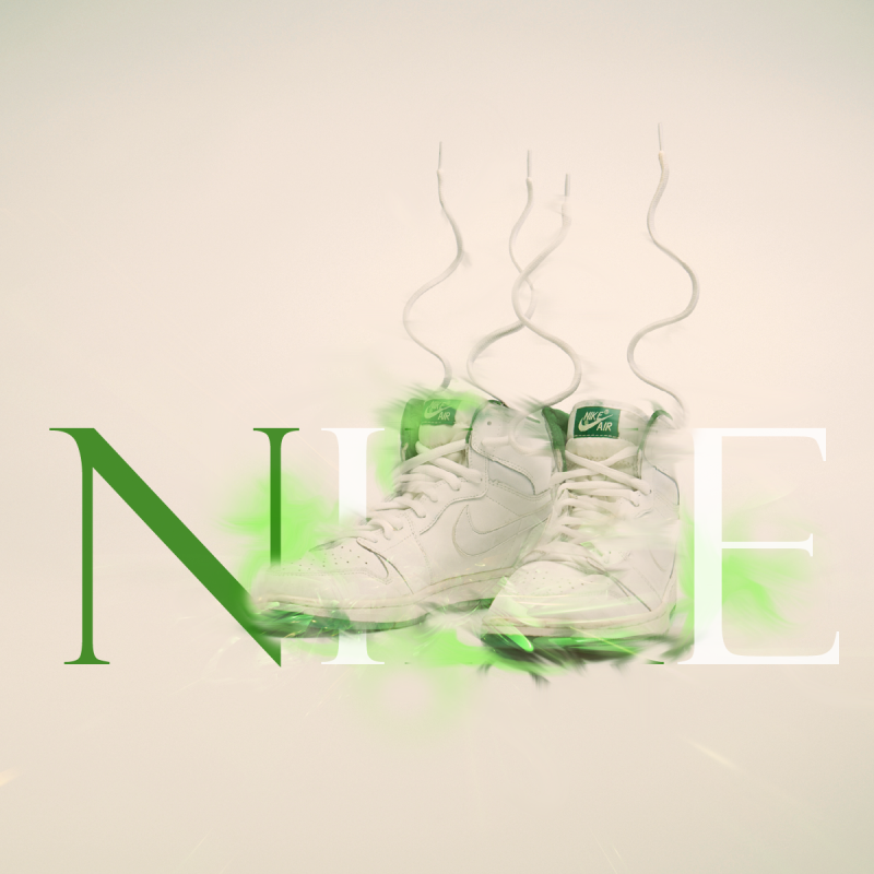
    It's attractive and nicely done. I do think that the shoes and text clash a bit. If I didn't know they were Nike shoes, I wouldn't know what the text said.

    It lies in the fact that you've used the shoes to cover the text, when they should be complimenting each other.

    It's interesting, but see if you can work on your focal points and placements a bit more.

  3. #3
    Join Date
    Oct 2009
    Location
    NC
    Posts
    2,136

    Default

    i dont really like the effects on the shoes. its not as clean, alittle sloppy IMO.

    text is nice, but im not sure how well it matches with the shoes

  4. #4

    Default

    Nice concept, the effects and glow are good but sloppy (the black area - inconsistent shading), maybe you can add more shading or reflections to give the impression of a horizontal plane. Text colour is appropriate, but maybe you can add more effects to blend it with the shoes.

Posting Permissions

  • You may not post new threads
  • You may not post replies
  • You may not post attachments
  • You may not edit your posts
  •  
Powered by vBadvanced CMPS v4.1.1