0 members and 4,147 guests
No Members online

» Site Navigation

» Stats
Members: 35,442
Threads: 103,075
Posts: 826,688
Top Poster: cc.RadillacVIII (7,429)
|
-
-

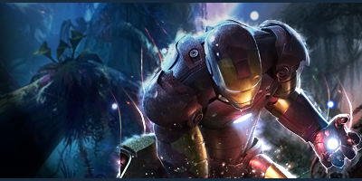
I dont like it alot, 97% of the bg has been covered by the c4d's. The c4d's aint that nice as well. Remove most of those c4ds' and let the bg be seen as well. It'll look much better, depth can also be seen visible if you do that. And ya text isnt that good, but for me txt is a problem as well, its really hard to place sometimes.
.:Latest & Favorite:.

-
-
yeah this time it feels good man nice text placement.
"You can delay but time will not"
-
The first one is nice, but the text placement could use some work, it's sort of taking away attention from the focal point.
Also, the black space on the right side of the signature is barren and open.
The second one is nice as well, but the light source is too strong, and it has the same text placement problem as the first one.
Also, try to lower the dark space on the left side of the signature.
Latest:

-
Go easy with the sharpening, it's too sharp(both ver). Still, the flow is quite good aswell as the text. :]
Last edited by Kipi; 12-08-2009 at 06:39 PM.
Similar Threads
-
By Dom in forum Sigs & Manips
Replies: 16
Last Post: 08-18-2009, 02:14 PM
-
By Kelso in forum Sigs & Manips
Replies: 2
Last Post: 08-16-2005, 12:39 AM
-
By ~FireTap in forum Digital Art
Replies: 3
Last Post: 07-25-2005, 06:14 PM
-
By ~FireTap in forum Digital Art
Replies: 16
Last Post: 06-29-2005, 07:21 PM
-
By Magnum in forum Digital Art
Replies: 13
Last Post: 06-22-2005, 11:56 PM
 Posting Permissions
- You may not post new threads
- You may not post replies
- You may not post attachments
- You may not edit your posts
-
Forum Rules
|


 Reply With Quote


