0 members and 698 guests
No Members online

» Site Navigation

» Stats
Members: 35,442
Threads: 103,075
Posts: 826,688
Top Poster: cc.RadillacVIII (7,429)
|
-
-

text is distracting.
everything else is good, though, except for that slightly empty space on the left.
-
The text is not that good, and the blending on the characters left side could be improved. I like the c4ds though =)
-
well i dont see anything wrong with the text matching the space idea, lol
dbut render is not simply mixed up add some feeling with c4ds.
"You can delay but time will not"
-
text distracts from the focal point.
nice other than that tho
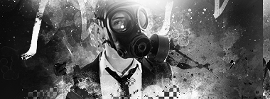 Burn After Rolling
-
the text seems fine to me, but you should have added maybe a few gradient maps or photo filters to it for blending, because that render sticks out way too much, whether you meant for it to or not. thats just my opinion though. and as far as the c4d's... 
-
nice depth here, and good effects.
the text most definitely needs to be worked with. take off the drop and change the font or make it smaller, because as of now the text takes away from your focal.
the lighting needs some work, i really dont see a nice source
gj
-
Really nice colors, effects and depht.
I think if you make the text a bit smaller it would look nice
Now it's too distracting.
keep it up!
Similar Threads
-
By Papa in forum Digital Art
Replies: 3
Last Post: 04-28-2007, 03:44 AM
-
By Blazter in forum Resources
Replies: 2
Last Post: 07-08-2006, 01:20 AM
-
By *Peng* in forum Digital Art
Replies: 1
Last Post: 02-27-2006, 03:00 PM
-
By Dale in forum Digital Art
Replies: 9
Last Post: 02-25-2006, 06:06 PM
-
By Smiling Demon in forum Sigs & Manips
Replies: 10
Last Post: 09-29-2005, 12:58 PM
 Posting Permissions
- You may not post new threads
- You may not post replies
- You may not post attachments
- You may not edit your posts
-
Forum Rules
|


 Reply With Quote


