GFXVoid Graphic Design Forum

Remove Text Formatting
Loading...

» Online Users: 6,541

0 members and 6,541 guests
No Members online

» Site Navigation

 > FAQ

» Stats

Members: 35,442
Threads: 103,075
Posts: 826,688
Top Poster: cc.RadillacVIII (7,429)
Welcome to our newest member, Lekelindids
Results 1 to 2 of 2
  1. #1
    Join Date
    Dec 2009
    Location
    Vancouver, Canada
    Posts
    177

    Default heaven & hell *large peice


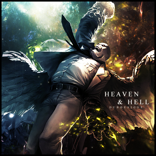
    made this for a gfx match on another forum
    still want to do a couple of tweeks and make a v2


    Burn After Rolling

  2. #2
    Join Date
    Apr 2009
    Location
    England, Newcastle Upon Tyne
    Posts
    996

    Default

    hmm not bad. personally i think the text spoils it. i mean it looks nice but just not right :\ i like the effects but i dont quite understand what you've done with the lighting. you have made a light source on the left but there is more of a shine on his right side. but nice coulors and i think depth could be a little better on that left side.
    good job overall, its looking nice
    ~Deviantart~

    Youtube : www.youtube.com/MrDeanage

Similar Threads

  1. Hell-heaven...
    By Devon in forum Sigs & Manips
    Replies: 1
    Last Post: 09-07-2007, 08:43 AM
  2. Pop art collab peice
    By Papa in forum Digital Art
    Replies: 2
    Last Post: 03-26-2007, 02:36 PM
  3. My best ever peice of art...PIE
    By Dale in forum Digital Art
    Replies: 16
    Last Post: 11-01-2005, 03:06 PM
  4. 1st peice
    By DinoKind in forum Digital Art
    Replies: 4
    Last Post: 06-07-2005, 08:01 PM
  5. hell-heaven thingy
    By dragoneye in forum Sigs & Manips
    Replies: 11
    Last Post: 03-08-2005, 02:19 PM

Posting Permissions

  • You may not post new threads
  • You may not post replies
  • You may not post attachments
  • You may not edit your posts
  •  
Powered by vBadvanced CMPS v4.1.1