0 members and 26,370 guests
No Members online

» Site Navigation

» Stats
Members: 35,442
Threads: 103,075
Posts: 826,688
Top Poster: cc.RadillacVIII (7,429)
|
-
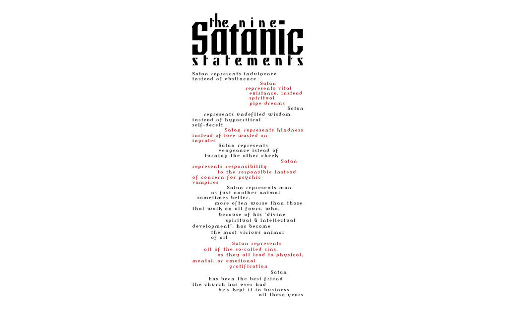
 The Nine Satanic Statements. The Nine Satanic Statements.
Not enough people do typography around here, imo, and it's a shame. Cause it's fantastic stuff to be doing.
It is, however, also very hard to come up with something original or, at the very least, something that only very few people have done before. So. I decided to make this as a poster (eventually to buy), but for now, a wallpaper. Concentrating, typographically, on placement and alignment.
The wallpapers are all 2560X1600 in size. You may shrink them if you wish. The download ZIP contains the preview version at full size, and three alternate, two that are textured background versions.
Enjoy
-
the allignment of the smaller text is nice but the big text spoils it. could be improved. but nice idea
-
The big text doesn't spoil it. It's a headline and sets the column.
-
kinda does. its a bad font
-
 Originally Posted by ShorterGFX

kinda does. its a bad font
It really isn't. Beside, I don't recall asking for C'n'C.
-
then why post? your bound to get CnC on a gfx forum -_- well i dont think its good. simple as
-
i think the txt works, but as a 'typography' piece, its kinda just plain, and boring, looks like an essay or poem.
and if your gonna post something without wanting cnc, post it on da.
In all deepest reality, we may only imagine the days past us, knowing that anything and all happens; and time will never be written until the happening... The future is 'eXcellence'.
eXx
-
Originally Posted by exorcist
i think the txt works, but as a 'typography' piece, its kinda just plain, and boring, looks like an essay or poem.
Typography isn't generally about making letters hundreds of different sizes and positions over some godforsaken filter-made background.
Photoshop filters don't make one a designer. Editorial Design wise it's perfect as it is.

Similar Threads
-
By NF7 in forum Digital Art
Replies: 2
Last Post: 06-24-2005, 08:44 AM
 Posting Permissions
- You may not post new threads
- You may not post replies
- You may not post attachments
- You may not edit your posts
-
Forum Rules
|


 Reply With Quote


